Research Part 5

Research part 5

Contents research page:

  1. Article by Terry Barett and my reflections
  2. Assignment 5 research
  3. Bibliography and images

Link to analysis of images for assignment 5: http://wp.me/p7xP3C-qu

Article by Terry Barett on context and photogprahy.

This article is a refreshing look at the seriousness of context in photography. Here I research the topic further using other sources as well as the primary paper by Barett.

Much is written about the importance of evaluation, reading and contextualising photos in order to gain maximum understanding and appreciation of their message. Barett in his paper (2010) discusses the relevance of understanding context and provides a formula that is often utilised in academic institutions for the analysis of photography.

“THE SAYING “A PICTURE IS WORTH A THOUSAND WORDS” is never more true than with a photograph. Photographs have tremendous power to communicate information. But they also have tremendous power to communicate misinformation, especially if we’re not careful how we read them. Reading photographs presents a unique set of challenges. Students can learn to use questions to decode, evaluate, and respond to photographic images.” Thibault M. and Walbert D. (2003).

I find myself more in agreement with this above quote as I deepen my own understanding and practice of photography. I personally believe that there is more of a chance of simply not understanding the message of any given photo, if the image is not correctly contextualised. In todays market plethora of photos, there is greater danger that due to the sheer quantity and perhaps less time to stop and really take in the meaning of things, we skip by only superficially taking in the message of a photo (thus not understanding at all) or we come to a  superficial comprehension. Therefore it would seem that to contextualise one’s work and to have some explicit elements within the contextualisation would be essential to the understanding of the work.

Barett in his paper starts his argument by looking to the photograph of Robert Doisneau’s of a couple at a Parisian cafe. He explores the picture’s original intent and then shows how a decontextualisation can lead to a change of meaning in the photo and the photographer’s original intent. The image is used initially by Doisneau in photojournalistic context. Later the photo is appropriated and used in three other contexts:

  1. A temperate magazine against the abuses of alcohol
  2. A french scandal sheet entitled: “ Prostitution in the ChampsElysées”
  3. Finally the image shows in art galleries in New York (fine modern art)

The change of context of the photo leads to several problems and can be seen again and again in the development of photography during the 20th century. Another example of this is the iconic photo by Dorothea Lang taken as part of the series ‘family of man’ ‘Migrant mother’ (1936):

http://www.artspace.com/dorothea_lange/migrant_mother_nipomo_california

The photo is later replicated and used in two different magazines to promote two different causes. What was the photo’s original intent? The original intent was also criticised by Pare Lorentz noting the following: …“In other words the appeal made to the viewer was premised on the assertion that the victims of the depression were to be judged as the deserving poor, and thus the claim for redress hinged on individual misfortune rather than on systematic failure in the political, economic and social sphere”  (Godeau S. 1991a: 179 in: photography a critical introduction: Wells 2009:43)

This would show that either a harsh criticism has been made, maybe with some other agenda other than the apparent or that the photographer really has dissociated the image from the bigger social, economic and political ‘picture’. Generally the response that the photo gives me is more on the level of the personal (this poor person needed assistance) but in the background of my observation is generally a sense that this (the issue/problem) belongs to a bigger context although not explicit. Therefore I would argue that this case is not necessarily so. If we are completely ignorant of the context of a photo however then this misinterpretation might be more easily made.

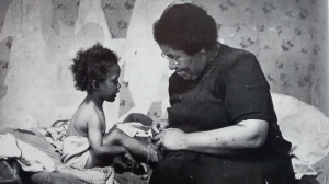
Michael Langford (1998:4) provides us with an example giving various possible interpretations of a photo that can range wildly from a simple documentation of an event to:

  • Life lived under a certain regime
  • A political document
  • Statement documenting the subjugation of women
  • A picture of warm relationship
  • A picture of dress and decor of a particular period in history in a particular culture
  • Demonstrating the effect of a lighting technique

Anyone of these interpretations may be given depending upon the factors surrounding the image such as placement etc. It would be difficult to assign one meaning to the photo and the only way to be clear is to understand (as Barett points out) a number of criteria to explore the meaning based upon the photographer’s initial intent.

Hardy B. 1949 Picture Post

Barett offers a method to assess and analyse photos that consists of a number of specific criteria. He offers three main headings for the contextualisation of the photo. 1.Information evident from within the photo 2. information surrounding the picture in its presentation 3. Information about the pictures making. These translate into what Barett terms “internal context”, “external context” and “original context” The internal context are things such as title, date, maker, the “external context” means where the picture is presented i.e street, gallery, journal art book etc. The “original context” refers to the “causal environment” which relates to the psychological and physical elements that went to make the photo at the time.

With this information about any image we can then see the original intent of the photo and get closer to its intended meaning. The untrained eye tends to see the image at face value or even immediately draws a false conclusion due to lack of training or awareness about the photographic medium.

In conclusion, without a solid understanding of  the context of photography we are likely to misunderstand or not fully appreciate the value of what the photo has to offer. There is a criteria that can help the viewer see the picture in its intended context gained by enquiring into the photos origin, intention and display. This criteria can also aid the practitioner of photography to deepen their practice by making more explicit the intention of the photo.

2. Assignment 5 research

Sophie Calle born: 1953, Paris

When looking for photos that drew my inspiration for this project my mind turned to Sophie Calle and her exploits in the street of Paris and Venice whereby she creates an adventure of following people and then in other episodes taking photos of peoples’ possession in hotel rooms such as in ‘Hotel room 47’ (1981).

Suite Ventiene (original title: L’Hotel, Chambre 47)

[7]“On Monday, February 16, 1981, I was hired as a temporary chambermaid for three weeks in a Venetian hotel. I was assigned twelve bedrooms on the fourth floor. In the course of my cleaning duties, I examined the personal belongings of the hotel guests and observed through details lives which remained unknown to me. On Friday, March 6, the job came to an end.” (Quoted in Calle, pp.140-1.)

Though my own project has not been so intimate as to be looking at others’ possessions and making photos of them nor can I say that own life “remained unknown to me”. The revelation that comes from looking into the lives of others holds a certain interest and at times fascination for us.

I feel in particular in this case that although her photos are far from exceptional photography she has given us an insightful look into how others behave. The way other people seem to live holds for us a kind of deep interest in the sense that we naturally compare ourselves with others in at times a somewhat conceited way. For me I wanted in a sense to share my circumstances of day-to-day life as a photographic diary. This is not the same as calle’s work but the material she uses is what has provided me with the ideas to do what I have presented in the assignment.

Evaluation of research and how it influences my own photos

Whilst I’m not entirely convinced that looking at and photographing a group of possessions of another person will give any deep insights into the persons personality and predilections, still it does point in some ways to a way of seeing people and what they associate with or identify with. It will tell us something. Also, in Calle’s photos of the hotel rooms we are not seeing people in their own habitat. We could draw more information from seeing their possessions in their place of normal use. A hotel room is sometimes treated as nothing like our own home. Therefore we can only draw limited conclusions from such a set of photos as Calle’s. It was on the basis of this conclusion that I have tried to show things in use in their place. Also, my presentation is tidy and homely whereby Calle’s is clearly a temporary stopping place whereby people will not have the same relationship to the place as their home. However, to give Calle credit, she has I believe inspired the project that I have done, even though the unfolding of it came quite spontaneously and did not require a huge amount of reflection.

My idea has certainly been inspired by Calle who I first discovered in 2015 whilst doing the OCA foundation course. However, I feel that I have taken the ideas that she presents and developed them in a more independent way that gives another feel to the work. So she has influenced what I have done but not overly dictated the outcome. I have allowed myself to explore her original idea in my own way. This was a very enjoyable process, although as I say elsewhere, some of the photos are less than riveting. However, I have created the feel that I wanted to create. The Idea of presenting the photos of things in their places was to emphasise that ‘things’ have a place in space and time. That they are inanimate in one sense, but indispensable to daily life on another.

When in 1983 Calle produced her well-known and highly controversial work ‘Address book’ it seems that she was marking out her territory as an artist and defining her main interest in art. The theme of identity gets explored and constructed and Calle makes contact with the people in the address book that she finds in the street. One thing that I like about Calle is this inventiveness based upon what she comes across in her environment. She seems to have a capacity to be triggered into creativity simply by seeing something that she resonates with. We can see the idea of identity coming out in Calle’s work.

In ‘The Hotel, Room 47’ Calle again is constructing identities albeit this time through possessions rather than phone books. This constructing of identities is an interesting subject although one that has been readily exploited in art. Within a series of photos of people’s hotel rooms we see their belongings. From this Calle creates identities that are visual for us to observe. We naturally start questioning and looking for clues in the possessions as to who the person is and what they are about.

This helped me to develop the ideas of photographing myself via my most frequently used possessions and the places in which I use them. Although initially I thought to shoot the photos with myself present in them, I later decided to simply group the items together and shoot them and then the place, as a way of suggesting my own presence. As to what conclusions the viewer will draw from what they see in the photos, I await to see.

4. References


1.Thibault M. & Walbert D. (2003) First quote: “THE SAYING...”http://www.learnnc.org/lp/pages/677 [accessed March 2017]

2.Barett.http://www.terrybarrettosu.com/pdfs/B_PhotAndCont_97.pdf PhotAndCont 97 (2010) Available at: [Accessed: 14 March 2017].

3. Lange D. (1936) ‘Migrant Mother’:http://www.artspace.com/dorothea_lange/migrant_mother_nipomo_california [accessed March 2017]

4. Wells E. Photography a critical introduction (2009) 4th Ed. Routledge.

5. Image 1. Hardy B. (1949) ‘Picture Post’ in: Langford M. Advanced photography (1998). Focal Press.

6. Images 2,3,4 Calle S. (1981) suite Vienetienne https://es.search.yahoo.com/yhs/search;_ylt=AwrIRlRgPNpYh2gAh0._.wt.?p=photos+of+sophie+calle+pictures+of+hotel+rooms&fr2=sb-top&hspart=GenieoYaho&hsimp=yhs-fh_hp&type=a87160058 [accessed March 2017]

7. Quote by Calle: Calle S. (1981) http://www.tate.org.uk/art/artworks/calle-the-hotel-room-47-p78300 [accessed March 2017]


Assignment 5

Project 2: Research

Research for project 2

The object of the photo was certainly to show Deep depth of field although I noticed that I’d used a 19mm lens at only f/3.5 aperture. I could of course chosen a much higher aperture but I did not a have a tripod to hand and the scene (ambient light) was dim.

A photo that I took in July 2015 in a region called Teruel, Spain.project_2_my_sample_d-o-f

Research of other photographers:

Fay Godwin – 1931 – 2005

Renowned mainly for work in landscape but also produced some portraiture work and abstract work, during her career. She first became interested in photography in 1966 taking photos of her young children.

Godwin produced some spectacular landscapes and, naturally those works represent the use of deep depth of field. She was born in Germany and travelled extensively until settling in Britain.

One picture I will draw out for analysis is the one below.

The distinctive view offers several focal points. Firstly, the leaning stone and the hedgerow that leans at the same angle in distance. There is clarity in the whole frame, the eye can see clearly into infinity. One other focal point is the rock to the lower left of the frame balancing to some extent the composition. The foreground has the leaning stone and the background the hedgerow.

Below image 1: Mona Khun. Image 2: Fay Godwin (1976)

3. Kuhn was born in São Paulo, Brazil, in 1969, of German descent. In 1989, Kuhn moved to the US and received her US Citizenship. Kuhn earned her BA from The Ohio State University, before furthering her studies at the San Francisco Art Institute. She is currently an independent scholar at The Getty Research Institute in Los Angeles.

Apart from Kuhn’s more etherial work in her nude portraits, she made some standard portraits such as this one above. The naturalness of her subjects comes about with her developing a close relationship to the people that she photographs.


References:

1. Godwin F. (1976) http://www.faygodwin.com/landmarks/im05/index.html   [accessed September 2016]

2. Kuhn M. (2011)  [accessed Sept 2016]

3. Biography of Kuhn M. http://monakuhn.com/pages/view/bio/ %5Baccessed Sept 2016]

Research: Assignment 4

Research for assignment 4

Contents:

  1. photographers researched and light diagrams for assignment
  2. research in studio lighting
  3. an aside from the assignment: some reflections on the world of consumerist photography v’s the long-term in-depth photo project (see this link to read:http://wp.me/p7xP3C-pP)
  4. bibliography and references

1.Photographers researched

All art comes from terrific failures and terrific needs that we have, it is about the difficulty of being a self” -Louise bourgeois

Reflection on quote

I saw this quote accompanying an exhibition at the IVAM art gallery in Valencia. It struck me that he used the words “terrific failures” and “terrific needs”. I liked the fact that he expressed it in this way. For me in a sense also I can relate to what feels like a “terrific need” or at least a strong impulse or desire to communicate myself in the world. Maybe  most art comes from this place within the practitioner: that they are trying to express the inexpressible and come to terms with some deeper reality that words can’t really explain.

I began my research with Andrija Lekic partly because I appreciated the photo in its own right and partly because I have a fascination for how to evolve photos and exposure in low light conditions. As I came to learn, low light photography is almost a specialist area in its own right whether in the studio or with ambient light in the field.

I also explored the work of Gregory crewdson and Sally man. Man’s work I like a great deal for a sense of other worldliness or timelessness that she portrays by using her large format camera with an uncoated lens to give an eery and special texture to the light tones.

assign4-1-of-1
Photo 1 and 2 Crewdson G, (2001) Ophelia (below) Lekic A, above (date/title not known)

However as we can see in my assignment I have only used the lighting and dark tones aspect as a basis from which to launch my own project which evolved in the studio and contains a story by a sequence rather than one photo.

Lekic’s photo shows lines of light transmitting themselves into space from the windows and therefore painting the image of the windows as a sort of projection or reflection. The night scene provides the appropriate dark tone setting for the contrast of light to be appreciated.

The frame is used in Lekic’s photo as far as I can see in no specific way that suggests the use of formal compositional techniques. For me the image gives a sort of ‘twilight’ or dream like feel. It has the sense of something happening that we can’t normally see.

Crewdson is an accomplished photographer using scenes that are built virtually as film sets. Crewdson is known to work also with a crew, which gives him as the photographer more flexibility and expertise to produce images that have a very strong visual content. The picture ‘Ophelia’ (2001) from: beneath the roses is a case in point. Crewdson uses expensive film set and crew to produce dramatic and curios photos. They can be somewhat disturbing psychologically. The exterior lighting that floods into the windows could suggest daylight or it could suggest street lights outside. The interior lighting creates a blue hue to the scene which gives in its eery, startling post catastrophe feel. The mix of lighting used by Crewdson seems to provoke many times in his photos a sense of the surreal.

copy-of-2001-gregory-crewdson
Crewdson, G. (2001) Ophelia (dynamic symmetry as device is used for composition).

The main focal point is Ophelia in the water. The eye is then imminently drawn towards the staircase and begins to scan the scene for evidence of her plight. I have seen several editions of the photo and some seem to have greater exposure than others so I am not entirely sure which is the original. I have focused more on the dark tone low-key lighting for my work and research. One compositional aspect seems to be the use of dynamic symmetry. The face of Ophelia is marked out to be the centre of focus within the complex image. Foreground elements are the space with water and background the stairs and furnishings of the house, windows and walls.

“”My pictures are about a search for a moment, a perfect moment, I don’t think there was never a time where I didn’t wake up absolutely feeling sick to my stomach.”

– Gregory Crewdson


Comment on Crewdson’s quote

I agree with Crewdson’s sentiment here. Whilst I don’t wake up feeling sick to my stomach which rather sounds like an anxiety issue, I can relate to a sort of creative tension that builds up around assignments. That there is the desire to express something fundamental about one’s vision.


– Gregory Crewdson

The elements shared between the two photos

  • They both contain predominantly dark tones
  • There are multi-points of focus not just one
  • They are both seemingly shot at night
  • They have different light sources

Images for assignment 4 and Light diagrams for assignment 4 studio lighting

Light diagrams

My equipment for assignment

Unlike Crewdson I have worked with much more modest kit and techniques. My basic framework was: a black backing (large 3×5 meters) a LED continuous focal lamp at 200w, a smaller LED lamp for second lighting focus and a circular reflector. I used my mobile phone to gauge the incidental light readings of the main subject in the photos. I used both a full frame with 85mm lens and fujifilm pro with a 35mm lens. I always work with fixed lenses as I believe the quality of the image is far better than any zoom lens can give.

3.Research in lighting 

Reading material was very much more geared towards the technical during this assignment. I focused more on strengthening my knowledge and use of lighting in the studio using three main sources. Child J. & Galer M. (2008) provided background reading on lighting. In particular I followed various exercises that based themselves on looking at metering and measuring ‘light fall off’ and setting lighting ratios in the studio. Activity 1 was to measure the incident light of a lamp on a wall at 1mtr, 2mtrs and 4mtrs to ascertain that 4 stops of light are lost from 1 – 4 meters. This was a useful studio light study to hit home the need to monitor light intensity changes depending on the distance of lighting for subject. I also did a series of test shots that are included in the assignment 4 page.

I also experimented with:

  • light diffusion
  • distance of diffusion from lights source
  • moving light source closer to and further away from subject to enhance or decrease shadow detail.
  • I began also to keep a record book of set up for camera and lighting so that I could repeat this lighting in similar situations.

Below is the first image that I shot for the series. It shows a man sitting in the process of writing a letter. There is a sense or touch of dramaturgy in the expression as essentially it is a staged photo. There is a story in the sequence. The lighting here as one can see is full half lighting. There are three main lit areas in the frame and this was completely intentional. The idea was to begin by creating a balanced frame and then slowly move away into more dynamic compositions to enhance the story and add some discomfort to the viewing.

First image from my sequence assignment 4

Problems with metering in dark tone scenes and tools for this

Reading from: Freeman M. (2011:20)

There are two basic problems that I had to deal with on this project. One is the danger of ‘banding’ and the other, noise due to hight ISO and low light conditions. The other is the question of focus on the subject again due to low light. In order to avoid both of these I needed to up the exposure slightly and then later on in post-editing lower the exposure but maintain sufficient highlights exposure whilst lowering the black. This gave me the desired look that I wanted. I also needed sufficient light on the scene to start with for focus. In the end I used a stronger light source than I had originally planned. The concern about exposing in the shadow was not so strong as the background is largely black and out of view.


5. references:

  1. Image 1 & 2: Crewdson G. (2001) Ophelia from the series: Twilight 2. Andrija Lekic (date title not known) 1.http://uk.phaidon.com/agenda/photography/articles/2012/november/13/gregory-crewdson-laid-bare-in-new-film/ [accessed February 2017]
  2. Lekic A.http://www.andrijalekic.com/photography/5 %5Baccessed February 2017]
  3. Prakel D. (2007) Lighting basics, AVA publishing.
  4. Freeman M. (2011:20) The low light photography field guide, The llex press Ltd.
  5. Child J. & Galer M. (2008) photographic lighting, focal press.
  6. Crewdson G. Quote:

http://uk.phaidon.com/agenda/photography/articles/2012/november/13/gregory-crewdson-laid-bare-in-new-film/ Internet [accessed February 2017]

7. Quote: Prakel D. (2007) Basic composition AVA publishing

Research assignment 3

Research for assignment 3 EYV

list of contents:

  1. Introduction
  2. Two shots done as test for assignment
  3. The assignment and chosen theme
  4. Researching photographers
  5. Some ideas and discussion around documentary and street photography
  6. Analysis of my images and self appraisal
  7. Bibliography and list of images

1.Intro:

I add this quote by the late John Szarkowski as a perpetual reminder to myself that ‘ideas are not enough’ in order to make good photography. Although indispensable and necessary, then comes the painful business of putting one’s ideas into practice to produce, in this case, a photograph.

1.’Some photographers think the idea is enough. I told a good story in my Getty talk, a beautiful story, to the point: Ducasse says to his friend Mallarmé — I think this is a true story — he says, “ You know, I’ve got a lot of good ideas for poems, but the poems are never very good.” Mallarmé says, “ Of course, you don’t make poems out of ideas, you make poems out of words.” Really good, huh? Really true. So, photographers who aren’t so good think that you make photographs out of ideas. And they generally get only about halfway to the photograph and think that they’re done.’

My reflection on Szarkowski’s saying here above

Basically I tend to agree with Szarkowski. The reason for this is that as I observe more and more photos and read statements about the photos, I see that some do not for me hit the mark. The idea might be extremely clear (if not a bit overly abstract at times) and then the photo might just not meet the idea. This sort of experience leaves me disappointed and cold. That the artist had great intentions to make a photo based on a great idea, then simply produces something quite normal and ordinary by way of a photo. So whilst the ideas are indispensable the photos need to complete and even surpass the idea visually to engage the viewer, from my point of view.

Research begins…untitled-drawing

Some ideas for the assignment to get started:

  • how we waste time…
  • death and love
  • significant moments in time…

Linking themes could be:

  • angle of view
  • place
  • time of day
  • building
  • period of time

2.Two shots done as a test for street images

untitled
Test image 85mm

Two test images that I shot in order to examine what kind of photos I wanted to work with. These images represent practice rather than anything of the finished assignment.

From looking at these images I have decided that I neither want the images to have shallow d.o.f nor such a narrow angle of view. I aim to bring more of the scene into the photo so will use a 35 or 28mm.

My research proper began by looking at the work from an edition of BJP by Matt Stuart. His work is of the genre of street photography and he is inspired, amongst other photographers by the work of Bresson. His work is interesting and touches on the use of humour and irony in order to highlight his themes. I would say that his work is entertaining rather than conceptually or intellectually interesting. It has something of the interesting eye view of Bresson or Winogrand but somehow without the depth.

untitled-3
Test image 2. 85mm

My style of organising the blog page here for research may at times take on a wandering element as I sift through the various ideas that I have been developing during the preparation of the assignment.

Here I list a few rules or guides from Bresson that I may use as background for the shoots.

  • Be quick and don’t linger
  • Use the environment to contextualize the image
  • Use one lens in order to be consistent. (I plan to work with 28mm)
  • Dont crop the image…(we’ll see!)

3.The assignment and theme chosen

So what I am aiming to do within the project is form a set of images with an interrelated theme. The photos will be done in the street and will be spontaneous. However, I am going to story board the images in advance and think through what and where I will do the shooting as best as I can. The main theme that interlinks each photo will be juxtaposition and ambiguity. I wanted to take this angle as I felt that the pictures should have a significant element, something that will define the set and tie them together as a group of photos. At the same time each image will be distinct.

In terms of juxtaposition I have investigated the work of various photographers to see a. Where they utilise juxtaposition and or ambiguity to good effect and b. What the linking elements is in their photos. It was an interesting exercise to see what different photographers use as a device in order to bring their work together as a body of photos.

As well as using the broad theme of juxtaposition and ambiguity I also thought about the possibility of using more than one juxtaposing element in each photo. Something more obvious and something then more subliminal. This may be easier to think about and discuss than to actually achieve in a photo as the images are not staged. Rather, they are going to be more spontaneous.

I also want to incorporate text into each photo so as to give each image a narrative. This inspiration in general has been taken from Duane Michals although not following his typical cinematic style of sequencing and perhaps finding suitable quotes to fit the images rather than writing my own text.

During my research I looked at the work of the following photographers a few of which I will analysis.

Lee Frielander, Harry Callahan, Cartier Bresson, Paul strand, Gary Winogrand, SzarKowski, Gordon Parks and Robert Frank. I also looked at the work of Tod Papergeorge, Duane Michals and Bruce Davidson, all of whom were influential photographers of time.

Szarkowski writes:

It isn’t what the photograph is of, it is what its about

(Szarkowski, J.)

This set me off thinking about this quote: 2.”at any given moment the accepted report of an event is of greater importance than the event, for what we think about and act upon is the symbolic report and not the concrete event itself.” (Ivins M.W, 1953)

Somehow these two quotes are related. They both point to the event in a photo being somehow either more than the actual happening in reality (exaggerated importance in some cases) or not identical with reality.

I followed up some writing on David Campbell’s website where he delivers a talk on: 3.  Narrative, Power and responsibility (Campbell. D, 2010) The main thrust of this talk is about how an image is a narration of an event that has taken place previously and that by that very act of narration we as it were, create the story. He also says that “research means we are involved in the construction of narrative” but that there are “limits to the way that we use narrative”. In other words you can’t completely distort the truth through your images, it has to work within the bounds of comprehension and believability in a context. Also Campbell acknowledges that no narrative (or image) can tell every aspect of a story.

4.Researching photographers, starting with Photos by Bresson

I have reviewed two photos by Bresson, working to get a sense of the photographer and how he made pictures. The first image I looked at was one called Siphnos, taken in Greece in 1972.

bresson_siphnos72
Image 1: Siphonos 1972 (Bresson, C.)

Image 1: Black and white, horizontal frame with main focal point on a girl climbing stairs in a whitewashed Greek village. The sun is strong casting shadow into the stairs so that the girl is in shadow. The forms of the buildings are pleasing and with soft angles leading the eye into the stair space. I like the photo as it is a slice of time and a place that conjures up many associations that I have with the Mediterranean. Aesthetically I find the image pleasing. I find the girl a little too distant in the frame, so that she becomes a small figure within the picture.

henri_cartier_bresson_photo_005
Image 2: Bresson, C. Date unknown

Image 2: Two men facing into a large cloth that acts as a fence. The camera is positioned behind the men, one man looks to the right over his shoulder whilst the other looks into the cloth with his face against it. One cannot decipher what he is doing exactly. He looks like he might be urinating!! I like the unknowing of the event as it leaves space for interpretation of what is going on and what the photo is about. The image is black and white and contains only three main focal points. The image has little background or foreground because of the angle of view. The key focal point is gaze of the man with moustache.

The linking theme for Bresson’s photos has to be the context and the way in which he frames pertinent moments in time. His images are stories in themselves, each one giving a particular narrative of an event. One can also see a meaning in his photos that goes beyond the photo. There is often a spirit of mystery and beauty to his photos. There is room to interpret and analyse as it is not always clear what the meaning might be. The above photo is a case in point. Bresson’s hall-mark was also the way in which he utilised the space around for the framing of the image. He was particularly conscious of geometry and knew intuitively how to use that for the photo. This gives rise to much visual pleasure.

Gary Winogrand

Windogrand is definitely one of my favourites from this particular genre of 50’s 60’s 70’s American street photography. His images have a liveliness and energetic quality that brings to life the scene that he photographs. Robert Frank was an influential figure especially in his early days, for Winogrand.

Linking theme:

Winogrand habitually used a 21mm lens initially till he found it was not easy to control vertical lines. One of his devices was to tilt the frame as often seen in his images, which brings about a sort of peculiar dynamic within the frame. Liveliness and keenness of vision are two of the themes within his photos.

garry-winogrand-new-york-1962
Image 3:( Winogrand G, 1962 New York)

Image 3: Man on the side-walk in New York amidst pedestrians looking slightly suspiciously above the camera. Winogrands tilt to of the right side down of the camera can be seen here. The shot is close in to the subject. It seems that the central focal point of the image is the man in the middle with the disapproving look. It is a hard expression. Something has taken his attention up above the camera although what that is we don’t know. All around we can see other points of focus such as the man coming into the frame from the right and them the ‘walk’ sign. The image is conceptualised clearly as a street photo. A photo taken in a moment without permission I would suspect, from the hip. The image to me expresses the human condition on the street of NY at that time, overcrowded, busy and noisy. I can imagine myself in the scene almost.

winogrand-dallas
Image 4: (‘Dallas’ Winogrand G, date unknown)

Image 4. A man crossing the street. His body form and posture speak volumes. For me the man is a caricature of himself. He seems to be collapsing to the ground even as his walks and I find this a curios subtle juxtaposition. He is animated and falling. Again we see Winogrand’s tilted frame and we see his usual irony through this man’s posture. I see what he saw and had I been there I would have shot the same image. He seems to have had a height advantage in that he is apparently looking down somewhat onto the man. I wonder if this was intentional?

The shadow of the man’s legs offer a dimension also to the photo which brings the frame alive.

Bruce Davidson

“I’m just a humanist. I just photograph the human condition as I find it. It can be serious. It can also be ironic or humorous. I’m political, but not in an overt way. Of course, everything we do in life is political. Almost everything.” (Davidson B.)

During my preparation for this assignment I have become particularly fond of Bruce Davidson. His images resonate in some ways, more than other photographers of a similar genre. I am learning a lot about the motivations of photographers of this era, be they ‘fine art’, ‘Photojournalists’, or just…good or ‘fine’ photographers, as Davidson preferred to think of himself. He was a humanist “observing the human condition”.

Bruce Davidson produces some of the more tangible Juxtapositions in his work. We can see that he is consciously working to frame things, in order to exploit this device which he does very well. Below I’ll show two examples of his.

USA. Palisades, New Jersey. 1958. The Dwarf.
Image 5: Davidson B, USA. Palisades, New Jersey. 1958. The Dwarf.

Davidson produced a series “The Dwarf” whereby he spent time with a circus crew, photographing them at his leisure. This image in particular resonates with me. It has both a visual impact from the strangeness of the scene as well as a sort of message about faces, personas and facade. The pretence of it all, the way we may try to look one way and be another, the social face and bullshit. He particularly focused on one character know as the “little man”. The little man was Jimmy Armstrong who was part of the circus in 1958.

USA. New York City. 1959. Brooklyn Gang. On the way home by bus.
Image 6: Davidson B, USA. New York City. 1959. Brooklyn Gang. On the way home by bus.

Again here we see an example of how Davidson played with Juxtaposition to formally highlight the difference in this case between race. It was a time of oppression in America, “the land of freedom” when only some were actually free!

Linking theme: There seems to be a strong connecting theme here of Juxtaposition as pointed out already. As a device this helps to add drama and style to a  photo as well as highlighting something that perhaps had not been seen previously. Also Davidson’s images take a rather human look at the world, tend to be quite warm and present and I think we can see how he interacted in many cases with his subjects, thus bringing this warmth to the fore.

Some ideas and discussion around documentary photography and art

In my research I have been asking various questions to myself. For example, what is the difference between so-called street photography and documentary photography. How are they different? Is one art and the other not? Is one more factual (therefore more valid) or do they both have the same value?

In reading the section on documentary photography in ‘photography a critical introduction’ (Wells L, 2009) Wells explores this area.

Allan Sekula (1978) says this:

“Documentary is thought to be art when it transcends its reference to the world (society) when the world can be regarded first and foremost as an act of self-expression on the part of the artist” (Sekula 1978: 236).

So in other words, according to Sekula the distinction is one of priority of emphasis? It would seem that he is saying so. However, more than that the photographer needs to define that emphasis clearly. The act of “Self expression” as opposed to documenting factual happenings is what seems to be the difference. The documenting of a thing or act or place has no particular angle or desire to express itself beyond what we see.

So in this assignment my aim with street photos (as context/genre) and the decisive moment (as concept) is to produce a set of images that are about self-expression of ideas and concepts that illustrate and make clear a feeling, mood or thought process about the world. Maybe the above statement is that ideally the photographer shows work that goes beyond the world and points to other dimensions of human experience. This however will depend upon a number of different factors. perhaps it is better that the photos just leave space for questions. Perhaps the pauses and empty spaces in an image communicate as much as the subjects in the frame?


references:

1.http://blogs.walkerart.org/visualarts/2006/12/20/john-szarkowski-the-perfect-photo/ [accessed October 2016]

2.William M. Ivins, Jr., Prints end Visual Communication.Cambridge, Mass.: Harvard University Press, 1953, p. 180.

3. Campbell D, 2010 Narrative, power and responsibility https://soundcloud.com/mattjohnston/david-campbell [accessed November 2016]

4. Images 1 and 2 Bresson C, 1972 (image 1) Siphnous https://es.images.search.yahoo.com/yhs/search;_ylt=A7x9Un978ypYaAoAT0i_.wt.;_ylu=X3oDMTBsYWhiN2NvBHNlYwNzYwRjb2xvA2lyMgR2dGlkAw–?_adv_prop=image&fr=yhs-GenieoYaho-fh_hp&sz=all&va=cartier+bresson&hspart=GenieoYaho&hsimp=yhs-fh_hp [accessed November 2016]

5. Image 3 and 4 Winogrand G, 1962 New York https://es.search.yahoo.com/yhs/search?hspart=GenieoYaho&hsimp=yhs-fh_hp&type=a87160058&p=photos+by+garry+winogrand [accessed November 2016]

6.Images 5 and 6 Davidson B, Dwarf and Brooklyn gang on the way home by bus 

7. Allan Sekula (1978) ‘Dismantling modernism, reinventing documentary’ (notes on the politics of representation) in J. Liebling (ed.) PHOTOGRAPHY: Current perspectives, Rochester, NY: Light impressions Co.

Research-Assingment 2

Research for assignment 2

For this assignment I have chosen the theme of ‘crowds’. Why I have chosen this theme is because I see it as both a modern day reality, that we will find crowds roaming the streets of our cities (especially tourists) and that from a symbolic perspective the crowd as phenomena has evoked some thoughts. The representation of the crowd could mean a number of things depicted in picture form.

Fig.1. ( koyaanisqatsi, 1982)

Crowds offer both a political threat to the establishment as well as a sense of camaraderie in the modern world when it is felt that the group represents values that one shares. Also, it can be an isolating experience whereby one can feel alone in a profound sense.

George Simmel has this to say about crowds:

Just as in feudal times the “free” man was he who stood under the law of the land, that is, under the law of the largest social unit, but he was unfree who derived his legal rights only from the narrow circle of a feudal community — so today in an intellectualized and refined sense the citizen of the metropolis is “free” in contrast with the trivialities and prejudices which bind the small town person. The mutual reserve and indifference, and the intellectual conditions of life in large social units are never more sharply appreciated in their significance for the independence of the individual than in the dense crowds of the metropolis because the bodily closeness and lack of space make intellectual distance really perceivable for the first time. It is obviously only the obverse of this freedom that, under certain circumstances, one never feels lonely and as deserted as in this metropolitan crush of persons.’ (Simmel, 1903)

Refelction Added April 2017

My reflections on Simmel’s quote

I think Simmel’s quote of man only being free within a limited context is a very apt and acute observation of modern society. The ‘freedom’ to choose what we want to buy or do is a freedom that is very confined. For me one of the reflections that I have about cities and their multitudes is that everyone is looking to gain in some way their idea of freedom. The problem is that we do not free ourselves following the crowd or towing in line with societies norms. In fact, this seems to lead many into a deep unhappiness and dissatisfaction with life, even though many people have the apparent freedom that was so desired economically and materially.

Planning the project

My planning for the project has unfolded around the idea of observing the crowd from within then bit by bit contextualising the group within its surroundings to show how it fits into the bigger picture. I aim to try initially to focus on one or two people within the group. Do I do this with permission or clandestinely like Sophie Calle? in ‘Suit Venitienne’. (1979)

My inclination for this projects is to do it clandestinely although we will have to see what the situation requires. Something of the idea for this assignment has come from the above mentioned text by Sophie Calle. Her idea sparked the a similar interest to pursue one or two people within the crowd and then seen separate and observe that process of separation. However, this may not fit in with my key idea which was to observe the crowd at ever greater distances thus seeing it from the microscopic to the macroscopic perspective.

crowd-in-the-rain
Fig. 2. Unknown author

The research here has unfolded over a number of weeks and follows to some extent the thinking process of that development. I initially had the idea of spatially expanding from the group by creating more distance from the group putting it into an ever greater context. However, this seemed physically difficult as part of that idea would have been to of gained an arial view to take the final shots of the crowd below in a the context of the city. The idea was to go from the personal to the more impersonal.

A changing idea

I then took the idea of the personal and the impersonal and tried a different approach; that of pursing a stranger within the crowd to show the personal within the impersonal. In other words, the anonymity of the crowd being brought to life by focusing on one person. The idea become more bouyant through a look at the work of Sophie Calle for her well known ‘Suit Venitienne’. (1979).

Pursing a stranger and ethics.

Generally we see it as questionable to follow a stranger with a camera, taking photos. We might conclude that this is kind of a paparazzi activity. However, I would say that this depends upon intention. In other words, does the intention change the action? I think that it does. If I am photographing to commercially sell my images then this may well be dubious activity. If I am photographing on the street (many times those images would not be commercially usable) for my own use, analysis, or course material I would say this is a different issue. Maybe from politeness we should ask if that seems appropriate. But what if that causes the person to be photographed to suddenly be self conscious and thus change the dynamic of the whole shoot?

‘…This brings me to the real meat of this article: what are the rights and wrongs of street photography? Yes, I do shoot a lot of random strangers, especially when traveling, and there are often shots I see but may not take for various reasons.

I don’t think it’s so much lack of chutzpah as the feeling that it may not be socially acceptable or ethically appropriate in various situations; photographing beggars and cripples is one of those things. Using people to portray contrasts or as anonymous human-scale elements in a frame is fine, but the one golden rule I stick to is that I’ll never take a shot that’s demeaning or potentially defamatory. You wouldn’t want the somebody to do the same to you, would you…?’  Ming Thein, (2012)

Comment on above quote

I believe that the writer above has a good rule of thumb. Don’t shoot in private places, respect privacy and don’t demean anyone in the photographs. I think that this is a reasonable view for the privacy of taking images in public places.

Sophie Calle seemed to go to extremes with her project by photographing not only the stranger on the street through Paris and Venice but also taking a job in a hotel in order to photograph the belongings of people in those rooms, later publishing the book that made the work well know. However there is something alluring in the photographing of a stranger. Something that every photographer probably feels at some point and that many try to capture in there lives.

By using a combination of different depths of field and angles of view I aimed to tell a story about this person, in this place and time. The codes of these different forms of expression give rise to different visual experiences that if used well can be visually strong.


References:

Figure. 1.Crowd from the film koyaanisqatsi (1982) http://www.koyaanisqatsi.org/images/gallery_koy/44.jpg [accessed September 2016]

Simmel G. “The Metropolis and Mental Life,” (1903) From the internet http://tomorrowstheme.blogspot.com.es/2011/04/driving-and-crowds.html [accessed September 2016]

Figure. 2.  Crowd found at: http://tomorrowstheme.blogspot.com.es/2011/04/driving-and-crowds.html [accessed Sept 2016]

Thein, M. (2012) The ethics of Photographing random strangers on the street http://petapixel.com/2012/12/22/the-ethics-of-photographing-random-strangers-on-the-street/ website [accessed Sept 2016]

Research notes – exercises 2.1 – 2.7

Research notes on exercises 2.1 – 2.7 part II.

General notes around research for this section.

I have set up a file on my computer known as ‘works of other photographers’. In this file I keep any relevant images for themes being studied.

  1. Explored photographers that used the given technique
  2. Questioned and explored my initial response to the work.

I explored the work of a few photographers that had used these techniques to make images to different ends as a start to my research.

Below an example of shallow depth of focus used to initiate and trick the eye. Here we feel that we are looking into the horizon at the sea when in fact the background is a studio set up for vogue magazine. There is also restricted viewing before the figures which are clearly the focus for the frame, indicating shallow D.O.F.

Below image by Horst P. Horst

This image I like and more so because I know that I am being visually coned into believing that I am seeing one thing when in fact it is quite another. From the point of view of how I respond to the image, it is the same. If I had not know that it was a beach scene (having an affinity with the sea and open spaces) I would still respond as if it were so. I longing to be in that open space opens up in me.

untitled-2
Image 1 Horst P. (1930)
  1. (Horst P, 1930)

This image below by Watkins also opens up for me a similar sense of space although this time seeing the distance with clarity because of the depth of focus. Although the focal point is the rock, the secondary focal point is the waterfall in the distance. It conjures a relation between the static and dynamic, close and far. Opposites that create an attraction in viewing.

Image of deep depth of field

untitled
Image 2

2.  Watkins C. 1878, Agassiz Rock and Yosemite falls

On Low camera angles

3. Below is a chart that indicates different camera angle views. Note in particular low angle and worm’s eye view.

angles
Image 3

The Low Angle (vertical orientation) Exercise 2.3

In exploring this angle of view I revisited some of my previous photos to see if I had used this perspective in the past. I had used it only a few times but not entirely consciously. Below, I found an article that articulates some of the potential effects of the low angle view:

‘Whatever it is you’re photographing – be it human on not – low shots, as a type of subjective camera angle, create the feeling that the subject is big, high, powerful, dominant, imposing, authoritative, or menacing. In the shot of the young women on the monkey bars, there is a sense of empowerment, freedom, and flight. Standing up, the young man is actually above them, but the fact that he’s further away from me in my low camera angle position makes him appear smaller than the young women, which emphasizes their power.

camera_angles4
Image 4:  J. Suler

By contrast, the viewer of low camera angle photos might feel weak, powerless, insecure, helpless, or overwhelmed in relation to the subject. You are in the position of the child, or standing in the land of the giants. You are, literally, “looking up” to the subject, perhaps out of respect.

Low camera angles of a person or object above us tends to isolate the subject from the surroundings. The sky or a ceiling forms the backdrop, against which the subject stands. That can be a convenient camera angle for eliminating an otherwise distracting or irrelevant environment. The minimalist background might take the subject out of context or accentuate the importance, distinctiveness, and power of the subject. In some cases the low angle might be disorienting, which could be a good or bad thing, depending on the intent of the shot.

In cities or landscapes, the very low camera angle can create feelings of awe, wonder, excitement, or being overwhelmed by the grandeur of one’s surroundings. In a garden or room, a very low camera angle will help the viewer appreciate the scene from the perspective of a cat, dog, or insect. Flowers and chairs look huge. Ordinary aspects of the environment not noticed or appreciated from a standing position, especially the underside of things, now take on intensified importance.

When shooting from a low camera angle with a wide angle lens, including a nearby subject and a background extending into the distance – e.g., a foreground flower with a desert landscape reaching towards distant mountains – the resulting image acquires a theatrical story-telling quality. Here, right in front of us, is the subject, but we see it within an expansive scene that provides us the background context of where this subject fits in, where it might have come from, where it is going, and why it might be here.’  (Suler J. date unknown)

The example in this foto is more akin to a worm’s view than simply a low angle of view which is what the brief of the exercise demands. However, there are obviously characteristics in common with any low angle view taken with the camera. The main quality that one notices is that the figure takes on a certain grandness of scale that they may not have in their real life or (neutral level framed) perspective. Depending upon the context i.e. background, the effects will be different. If the background is very low and indoors, it could be less intimidating than for example a city scape that also view high rise buildings above the person. Or a mountain in the background that would accentuate the tallness of the person further. So context therefore will also influence the way that such an image is perceived.

2,3_low_angle_of_view

Above my image taken for the exercise. I asked the subject to keep a neutral look so as to add to the feel of the picture. I used the stairs as a backdrop to emphasis upward movement and to support the upward angle for the framing.

Exercise 2.4 Portrait

The shallow depth of field in the image brings into relief the strength of the face of the person being photographed. Therefore in order to provide a portrait that is clear and vivid this technique of shallow d.o.f. works well to reduce background distraction. Personally I like the effect of a shallow background view. It has become so commonplace as an image, one might cease to see it afresh and pay attention to the background in many cases. Therefore the background does need to have something to add to portrait in my opinion.

5. Example below from ‘living exposed’:

Gordon Peacock at The Farmer's Arms in Muker by Josef Tornick fo
Image 5
outdoor_portraits_camera_tips_dcm128-feature-spread3__dsc1610
Image 6 From:http://www.techradar.com/digitalcameraworld

Exercise 2.5

Example from my own exericse:

At f/3.2 as with such a long distance behind the main subject, the depth of field only reveals an outline of what is there in the background. I attempted to balance the shot in terms of symmetry by centring the mountains and putting the cross to the middle of the frame. On second thoughts it would of been more interesting not to do that but to place the cross to one side.

untitled-11
85mm       f/3.2        1/200 sec

At f/3.2 with infinity set in the lens the object (given the nature of it) almost disappears from the frame.

untitled-12
85mm    f/3.2    1/200 sec

Exercise 2.6/2.7

Using respectively wide aperture and long focal length and then small aperture and wide lens (greater depth of field) I explored the environment where I stay.

2.6 Composing the background that is out of focus is not as easy at it first sounds. Usually my approach has been to more or less incorporate the background in a random sort of way. Focusing more on the subject has been more important.

I first thought that the background ought to say something about the subject. There should be a communication between subject and context. So, in some of the examples given in the exercise 2.6 I have worked to include more of a compositional feel into the background.

In the blog section for this image I give a diagram explaining the composition.

Man_back-9-Edit copy

2.7-Below one example from my series related to 2.7 on depth of field. Here I took an image and filled the frame consciously to explore if the frame remained with depth of focus throughout the different aspects of the picture. Also, as mentioned in the exercise this image has no one-point-of-focus. It is deliberately composed to give the eye a roaming and viewing experience.

edited_

Conclusions and summary for exercises 2.1 – 2.7

The exploration of depth of field and angles of view have been the subject of this section of the course. The use of greater, or lesser depth of field can change dramatically the interpretation of the image as seen. Also we have explored the use of the out of focus background as part of the composition and different focal lengths to explore how this interacts and changes the space of the photograph.


References

1. Horst P, photography the whole story, (2012) Juliet hacking : 262 (Thames and Hudson)

2. Watkins C. Agassiz Rock and Yosemite Falls from union point, (1878) The whole story : 134, Juliet Hacking (Thames and Hudson)

3. Camera angle views found on web [accessed September 2016] https://es.search.yahoo.com/yhs/search;_ylt=A7x9Un1I_s9XuRUAWUK_.wt.?p=camera+angle+down+looking+up&fr2=sb-top&hspart=GenieoYaho&hsimp=yhs-fh_

4.Suler J. Photographic psychology,internet article [accessed September 2016] http://truecenterpublishing.com/photopsy/camera_angles.htm

5. Living exposed, internet [accessed September 2016] http://www.living exposed.com

6.From:http://www.techradar.com/digitalcameraworld [accessed Sept 2016]

Research part 2: focal lengths and viewing angles

Michael Langford in his book: Basic photography (Langford M, 1977:78-79) discusses the use of different focal lengths for bringing in different perspectives to the photographed image. He uses the example given below to talk about how changing both focal length and distance from the image to bring about changes in the distant and near elements within the frame.

The ability to be optically true to the subject according to the eye or to distort the true image is then related to the lens focal length more than the angle of view. A 28mm lens will yield quite a different image compared to the the 150mm lens. 50mm lens is seen as the equivalent to the human eye angle of view.

untitled-14
(Langford M, 1977)

You can use steep perspective (close viewpoint wide-angle lens) whenever you want to exaggerate distance or caricature a face into a big nose and tiny ears, or dramatically emphasise some foreground item such as an aggressive fist by exaggerating its relative size.’

Comment on above

Langfords diagram of three images at different focal lengths proved useful for seeing just how visually different these images are depending on the perspective.


References: Langford M, Basic photography: 1977  (focal press 6th edition)

Research – Ruff’s jpeg

Project three research point-Ruff’s Jpeg 

Ruff’s jpeg is seen as an exploration of the aesthetic of the pixel and a questioning of the jpeg image and what it represents. The images by Ruff in the series ‘jpeg’ are presented to stimulate a new view of the modern and archive based electronic medium of the digital photo. According to David Campany Ruff’s work ‘challenges us aesthetically and intellectually’(Campany D. 2008) However a counter view is offered by Joerg Colberg.

Screen shot of Ruff’s work

Screenshot_project3

Colberg states that the work has no significance beyond the aesthetic or in other words the appreciation of composition, tonal qualities and form, shape and the use of space. (Colberg J. 2009) For him there is no deeper meaning to the image than what is seen.

The images of Ruff offer a view of the pixel. It is unusual to see the digital image used in this way. One point that is brought out is the common day use of found images. The searching and extracting out of archival work and then reworking it in order to make a statement is a practice amongst artists. It challenges the viewer to see anew something that they think that they have previously understood.

The attitude to the pixel is somewhat different from that which it formerly replaces through analogue photography, which is to say: grain. Grain had something of a prestigious quality to it and was aesthetically desirable in some images to augment the photo and was part of the visual language. The pixel has a somewhat different interpretation of being mechanised and even seen as a failing of the image.

Colberg reflects in his article: is beautiful sufficient? Campany believes that Ruff has introduced a philosophical element into the use of the pixel and opens up for question the nature of the digitally produced image.

Added May 2017

Below an example of a pixelated image of my own. The first thing to strike me is the abstraction that the image suddenly acquires. It goes from literal to abstract simply by reducing visual clarity in the image.

assign4 (1 of 1) copy
my own image reduced to width 100pixels


References
Campany D. Iann magazine No. 2, 2008,aesthetic of the pixel

Colberg J.April 17, 2009, conscientious

Source for photos:

Campany D. Iann magazine No. 2, 2008,aesthetic of the pixel

Research and thoughts on Square Mile

Contents of this page include research of all themes in part 1 – 5 of the course: Expressing your vision.

The square mile brief is to produce 6 – 12 images with the theme of exploring the environment and or people within that environment. It can be a more landscape architecture based project or more inclining towards exploring people in their setting. One can also deviate from the theme providing there is good justification for it. This is what I did when I did the exercise first time around in the foundations course:

https://truevisionphotography.wordpress.com/2015/06/05/assingment-1-square-mile/

Now moving on and confronted again with the same brief I need to think about it anew.

Key terms for the square mile assignment:

  • Examine change
  • Explore surroundings
  • Meet people
  • Architecture/Landscape
  • Series of images that fit together (think whole not parts)
  • Transmit ideas effectively through images
  • Communicate my interests/ambitions as a photographer

First points of research:

(Keith Arnatt, 1930-2008)

The television interference project (1969) From the tate britain exhibition: conceptual art in the britain 1964-1979.

Looked at the Self burial series (Keith Arnatt, 1969) in black and white (the television interference project).

Keith Arnatt, Self burial, 1969 https://es.search.yahoo.com/yhs/search?hspart=GenieoYaho&hsimp=yhs-fh_hp&type=a87160058&p=keith+arnatt+self+burial [accessed: May 2016]

Straight away I really appreciated the context of this work and how it was used and displayed. The television interference idea I thought was an excellent concept. Why did I think this? Because it was breaking into a repetitive way of being (watching TV is rarely a creative process) and showing something that might stimulate thought and reflection as to what we are doing with our lives. It seems that art perhaps used in this way can bring a vivid dimension to the experience of the viewer.

I liked the concept and the way it was delivered to the viewer. It reminded me of anonymity and being somehow removed and present at the same time. There but not there.

Depicted sequence: The artist burying himself in stages until one just sees the top of the head from above the ground. Each stage is photographed. Arnatt’s work is intriguing although theoretically quite complex. It called up some feelings of far fetchedness in its explanation and a somewhat rarefied concept.

(Tina Barney, 1945)

Tina Barney, Jill and Poly in the bathroom, 1987 http://en.wikipedia.org/wiki/Tina_Barney [accessed May 2016]

  • Profile: Studied art history at the Spence school, Manhattan
  • 1973 She took up photography
  • Known for her large colour prints portraits of family members
  • Exhibitions: The Europeans, small towns, players, Europeans II and III, four decades.

Focal points in this image: 2 main figures in the bathroom, the faces being the main focal points. The bathroom with its pink interior and overfilled space distracts the eye somewhat from a  single focal point. The next main focal point is the back of the women in the mirror and then after that the curtain being drawn open by the same figure with her back to the mirror.

Tina Barney, Jill and poly in the bathroom, 1987 http://www.art.edu./aic/exhibitions/story/selected.01.html [accessed:may 2016 OCA website]

The image is densely packed with interior design probably typical of the age. This makes for slightly tiresome viewing as there is a sense of the image being distracted. There is a certain coldness in the relationship between the two women which Barney was reported to have commented “This is the best we can do” referring to a period in middle class America when social relations were marked by a distance of affection.

Peter Mansell

Peter Mansell, http://www.weareoca.com/photography/peter.mansell [accessed May 2016 OCA website]

First impressions: Good work with an interesting angle. I liked the way he went from local to global. It’s an interesting way to think about landscape and I think that he showed his relationship to it well. I felt that the theme although interestingly displayed, was a little predictable for someone living with that kind of disability. The most interesting shot was that of the scuff on the wall in the house, as it was the most indirect and suggestive. Compositionally I can see he’d thought about the images. Some were more interesting visually than others, such as the opening shot of the sea and the wheelchair looking out, without anyone in it.

The image of the set of wheelchairs in the shop felt like photo filler, rather than adding anything to the sequence.

However, on balance this set has been the most useful for my own research and I take away a number of ideas from this for my own assignment. First, the idea of working from the local to the global giving a rounded sense of belonging and placing in space and time. I thought this was useful. Next, the detailed to the more general, which links in to the former.

Robert Franklin

I looked at the series by Robert Franklin, Wales, 1953.From story line [accessed in IVAM library, Valencia May 2016]

  • Robert Franklin
  • Date of work: 1953
  • Wales, UK

Another set of photos that were interesting to me for the project was the study of a miner from Wales who was depicted by Franklin in 1953. The scenes are quite sobering and stark. Rather difficult to digest that this is someones life in this place. The whole sequence is interestingly finalised by an image of a cemetery, an often depicted scene that culminates the set. That this is the end point of this persons (as all) life and…has it been worth it? For what did he really live, to simply dig pits and provide coal?  TBC.

Robert Caper influence

For this assignment I am shooting in Spain. Spain is where I live part of the year and work. I travel around a fair amount and find that subjects for photography here know no bounds. As Caper himself said, you only need to turn up with the camera in Spain, the rest is there. Of course, this is not what we are about as OCA student photographers. It’s not enough to make ready-made compositions, but if your subject matter is that much more interesting and stimulating its helps the process of composition to unfold.

One of the photos used in the sequence was strongly influenced by Robert Capa. To see the image I am referring to:

https://pro.magnumphotos.com/C.aspx?VP3=CMS3&VF=MAGO31_10_VForm&ERID=24KL535353 [accessed May 2016]

Although my series is not predominantly street photography based, as the work developed I decided to draw in several photos that were of a more documentarial or vernacular style photography.

Analysis of my image.

Girl walking up a hill with loaf of bread. There are three main focal points in the image: The bread which occurs in the lower left third of the image, the sign pointing in the opposite direction to Valencia thus adding a visual tension between the girl moving one way and the sign pointing in the other. The shutter speed was at 1/30 at 28mm fixed focal lens and so blurred but not too much. I wanted to introduce a sense of dynamism into the series of images to contrast with the stiller more reflective images such as the broken pane of class in the door.

Lines in the image: horizontal (building in background) vertical (sign of Valencia), somewhat diagonal with the slopping down of the street to the right of the frame. This setting was chosen for the lines of composition. The frame was later cropped square. I adjusted the white tone balance to make it slighter darker and darkened the blacks in order to highlight the girl’s hair a little.

untitled copy
Daily bread

Research and reflection on semiotics (semiology)

Study source: Photography a critical study, (Liz wells, 4th edition,2009:30) reading the image.

I had been thinking about why some images have an impact on me and why some do  not. This reflection lead me to look into the theme of Semiotics or the study of symbolism. There are many facets to this subject and there are different theories. The one that most interest me is the one whereby we interpret and assimilate information from an image. According to one of the leading protagonists in the field of study of semiotics, there are two branches of study: Iconic or indexical and symbolic (Pierce,1839-1914). Iconic codes are based upon resemblance such as a picture of someone and Indexical codes or symbolic codes indicate the presence of something or someone, such as footprints for example. They allude to something rather than representing it in concrete form.

It is argued by Liz Wells that symbolic codes are arbitrary in that the symbol will not necessarily been interpreted according to the intention of the person making or presenting the symbol. Their meaning may not get deduced. This might mean that for example one produces a photo with the intention to illustrate a particular point or idea or stimulate a certain reflection but the interpreter does not cognize it or recognise it. This may be due to cultural or social conditioning. However, it might be that the symbol does not match the object that it tries to represent in some cases, whereas in other cases it does. It would be difficult to contest the example given of foot prints in the snow representing the absence but, before the presence of a human being. However, in other cases there could be a backfiring of this interpretation and it could be missed due to cultural differences. Thought in process…

Project 3 surface and depth research

“Photography investigates no deeper relief than the surfaces. It is superficial, the sense of the words; it studies the shape and skin of things, that which can be seen”

Comment on the above

Added April 2017

I find myself not entirely in agreement with the above quote. If taken literally, yes, in a sense a photo only explores the surface of things and what you see is just that. Shapes, forms etc. But also photos represent and are symbols that can be interpreted according to the imagination of the person. To say that photography explores “no deeper relief” I feel does not answer any questions but simply leaves more for me, personally.