Bill Viola and David Lachapelle, two curious artists

Bill Viola and David Lachapelle

I first saw an exhibition by Viola way before my photography days in London at the National gallery. It had to do with faces, well emotions on faces to be exact. But the images were not stills they were moving images, videos. The intriguing part was that the movement was in slow motion. At the time I was taken by this. Later I saw other pieces of his work such as the figures under fire and water, and human faces submerged under water…are they dead or alive? Either way his work has attracted attention and for me he has reemerged into my visual awareness as an artist worthy of investigation.

One piece of work that stands out is: The Crossing (water), 1996 which is a video sound installation that involves a figure walking out of the dark and then being showered upon by a downpour of water.

[1] Image 1. Bill Viola, Water (from the crossing) 1996

Like many or most of his pieces, they are dramatically produced. Often he uses a dark background to maximise the use of studio light in combination with the music and movement. 

The music that accompanies his pieces evokes another level of response in addition to the visual element. It is strong stuff. Often I find myself thrown into a kind of existential reflection of some kind, often life and death!

There are often strong religious connotations in his work, that seem to reflect something of his own view of religion. Unlike the work for example of ‘Thy kingdom come’ (2009) Lachapelle D. his work has a seriousness as opposed to a rebelliousness that I see in Lachapelle’s work. Their styles in some way are very similar if viewed as stills and not video. The work of Lachapelle is also quite cathartic and often has sexual symbolism and imagery mixed in with the religious. His work (and his video film work) are like visual punches to the abdomen. His work falls into the genre of semi-surrealism and fantasy.

It strikes me as interesting that there are many tools at the hand of the visual artist, especially those working in the digital mediums and these two artists have exploited very thoroughly the use of this medium.

Helmut Newton comments of Lachapelle:

He isn’t very impressed by current photography. ‘‘There’s a lot of pornographic pictures taken by the young today,” he said. ”There’s a magazine, Purple.” He frowned. ”A lot of the nudity is just gratuitous. But someone who makes me laugh is David LaChapelle. I think he’s very bright, very funny, and good.

To this I would have to agree. That a lot of what passes as visual nudity really now is beginning to feel a bit past it and pretentious to my eye. However, with Lachapelle I can see a social message, a commentary happening which makes it more interesting to engage with.

Viola has the capacity to capture the attention of the viewer through the video work. As the videos are usually in slow motion, it means that one has to stay with the movement of the frames to see what the outcome will be. Thus they are a kind of moving meditation.

I chose to compare these two artists because I have been impressed by them both for the way that I felt that they affected me and also to explore their very different styles and to see how they are both effective.


References

  1. Image 1. Viola B. Water http://www.billviola.com [accessed April 2017]

  2. LaChapelle D. Thy kingdom come (2009) http://davidlachapelle.com/series/thy-kingdom-come/ [accessed April 2017]
  3. Newton H. Helmet Newton’s new book. Article by Cathy Horin (Nov.16 1999) http://www.nytimes.com/1999/11/16/style/helmut-newton-s-new-book-with-its-own-coffee-table.html?src=pm [accessed April 2014]

Log notes-part 5

Log notes

Contents of log:

  1. Where am I at in the photography study?
  2. How the exercises have influenced assignment 5 plus Crewdson’s work
  3. A word about viewpoint
  4. Reflection of Burgin’s comment
  5. Photo sample of previous ‘homage’ to a photographer (philip Lorca di corcia)
  6. Rinko Kauwachi’s image
  7. Modes of photography
  8. Reflections on assignment 5
  9. The need for context in photography
  10. Quentin Bajac
  11. Sontag
  12. Analysis of my photos and Evaluation of assignment

*NOTE: Analysis of my images for this assignment and evaluation at bottom of page


1.Where am I at in my photography-2 years study with OCA

To date I’ve completed (nearly) two courses over two years. I’m aiming to do the level 1 courses in 10-11 months so as not to slow down too much. For this I need to put in three whole days study a week and its still feel like I could do more.

I have made a reasonably big commitment in my life to photography and the visual arts and now it seems that it will be the case for a very long time. I have gained immensely from my studies with OCA. The approach suits me as opposed to my previous studies of photography at Espai d árt fotografic. The approach of reflection also works well for me as this is something I am used to doing thorough my other studies and through my life. It makes sense. It has been said that there is nothing more self indulgent than art…a solipsistic pursuit rit large!! However, I only sometimes see it like that. Its not all about me! I find that there is a universal message in the best photos and one that conveys strong feelings can really be effective. If photography was simply about my own process, it might not be so interesting in the long run. As it is, it has a profoundly important place in my life as means of expression and communication. Many people in my life know me directly through my photography rather me as a person in person.

In terms of what I have gained it has been immense. I have gained a great deal technically and visually and artistically. However, I still feel along way from my goal. My goal as a photographer is to produce work. Who doesn’t want to be recognised in some way for the work that they do. But its early days. I think that I am realising that my career will not me predominantly commercial by rather artistic. This means a lot of dedication and time on top of an already full life that I have. But I feel determined to make it happen. My weaker areas are those to do with post production work and knowing those tools with more fluency. I plan to do some more study in that area of the coming months. Having said that I have leaned a lot in that arena as well. Curiously there was on that in the foundation course than with EYV.


2.How the exercises have influenced my project in Part 5

I was inspired by the idea that ‘viewpoint’ is a changeable situation and that there are perhaps as many ways to say something with a camera as photographers. My first instinct in this part of the course was to shoot something more documentary; a document of society from my point of view. However, that project will wait for another time. Instead, following the remit that “in the end it is something that you like…” I decided to photograph my own dwelling space ‘Home’. 

From Civil imagination (2012) Ariella Azoulay describes how one should be free to explore photos imaginatively. This fits into the idea of context and might also contradict as well. If the remit is purely to “imaginatively explore” then does the context matter? If what we want is to let the imagination roam we are free to explore photos without knowing the context or intention of the artist…

Exercise 5.1 was a curious example of an exercise that could be interpreted in a variety of ways. I took it to be a question of resonance and as the remit said ’empathy’ with the subject. This helped me a bit in thinking laterally although the frustration around trying to portray a closeness to something that is not a person, was indeed frustrating! So the exercise pushed the boundaries a bit but was not particularly enjoyable for me personally. I ended up interpreting the photo for what it represented and analysed it more as a visual document of something in myself that wants expression. As for the interpreting of the things that were not intentionally wanted in the frame I found that harder.

Exercise 5.2 was useful for contextualising more how I respond to images, by having to respond to an image by another image made by myself. I tend to respond to images that have a strong message rather than just strong composition or aesthetics. This is coming out more as I photograph more and study more in this context.  It helped me contextualise my photo in the sense of making me think more clearly about it and what it wanted to say. In particular it made me see that one’s response can be different at different times and perhaps on another occasion I might want to respond differently to the theme.

Artistically I felt that exercise gave me room to explore my own imagination as per the photo that I produced for the exercise. This translated to the ‘home’ assignment that I did in being imaginative about how I portray home or the place that I dwell.

Added April 2017 Crewdson’s influence

Crewdson’s image of Ophelia, the darkened tones in the scene and the lighted areas within the scene were one of the main basis for the way I organised the assignment lighting. I have of course developed that somewhat and used few focal points in the frame, less drama in the characters and a much simpler lighting set up. As I looked more at the photo I saw how the use of lighting creates the particular feel of the scene and that without the lighting methods he would not of created the photo with so much success. In particular the lighting (see assignment 4 page) that falls on Ophelia as she lies dead floating in the water. The whole scene dramatically emphasises how the theme (Ophelia) is brought ‘back to life’ through being placed into a new more contemporary scene. The form of spot lighting that Crewdson uses is very sophisticated compared to what I used to shoot my photos for the assignment. However, the idea that I had pre-visualised was to use the lighting to create emotion (sadness, loss, grief) by isolating the characters in an otherwise darkened scene and placing the light on few elements. The difference was obviously that my scene was somewhat non-literal in the sense that you did not see all of the context where the events were taking place, but more a suggestion. This was entirely intentional.


3. A word about viewpoint

The question of viewpoint has been interesting me more and more recently. As I can or am starting to see the relevance of having one’s ‘position’ clear when taking a photo so that’s its relevance can be seen more clearly and specifically. At the same time photos are often left open for interpretation. In documentary photography there is probably a different outcome than for example with staged photography. Staged photography aims to say something about perception and so does documentary photography. The different would be that documentary is more facts or information oriented in the sense of relaying news or some happening in the world that is political or social or economic or otherwise. Staged photos might also have something to say about those things too. Often they are used to make more psychological statements about how we are as humans or can be.

So one’s point of view is informed by all sorts of factors. I think for me as a photographer I’m interested in an area of communication that is somewhat more difficult to get to, which is the metaphysical and the spiritual. I like to take photos that question values and priorities. I like to see photos that raise up big questions such as. ” what is the purpose of our existence”. These sorts of photos are in my experience not easy to come by. Again, in terms of contextualising the image, the “external context” of [1]Barett (2010) is all important. How does one portray an angle or viewpoint on religion or other existential issues? Can these things easily be misinterpreted?


4. Reflection on Burgin’s comment

[2]“The hackneyed idea of ‘influence’ is not at issue here. I am not interested in the questions of what one artist may or may not have taken from another. I am referring to the universally familiar phenomenon of looking at one image and having another image spontaneously come to mind” Burgin (1986).

This quote from Victor burgin expresses aptly and clearly what I felt I was doing in exercise 5.2. After mulling it over for a while I found myself with a  spontaneous image in my mind, all of it as a piece suddenly. Then I got to work with creating the scene to take the photo. I find that this happens more and more as I study more deeply and take more images. Probably there is a momentum of development that is underway that allows the creative imaginative side of the mind to come to play. As with anything that you train, it develops under practice according to the laws of cause and effect.

Burgin’s quote struck a cord because in a way it was a simple and powerful way to say that this human tendency can be put to good creative use. Its not stealing or borrowing, it is one’s own creative process activated in dependance of coming into contact with the senses and then the mind processing that to produce an idea, image or concept. It seems to be the way the mind works, through inference and by association.


5. Photo in homage to Philip lorca di Corcia

This photo I made during my foundation year with a remit to ’emulate and favourite photographer. At the time I was very into and taken by di Corcia. I still appreciate very much his work, often emotionally provocative and charged. This is my attempt to give ‘homage’ to his photo of the girl in the restaurant being looked back at by some boys.

Here is one of my photos of a ‘homage’ to Philip lorca di Garcia.

[3]Image 2. Philip Lorca di Corcia (date unknown)
Image 1. OCA foundation photography: Emulating Di Corcia

This is staged photo shot by me, explores the typical light setting that Di Corcia would use, although my light source was a lot cheaper and simpler. The photo I made here has more in common with his series ‘heads’.


6. Rinko Kawauchi’s image from book cover

[4] Image 3. Rinko Kawauchi Iluminance (2009)

Interesting image, It has something but I’m not sure how to explain it. I suppose the title luminance does say it to a great degree. It talks of intensity and awakened states. The awakening of what I’m not sure as I’ve not read the book. Looking into the heart of the image you get a sense that something is in there and is very hot! Its like looking at the sun. After a while the eyes get tired of such ‘overexposedness’ and start to want to rest.

The counter to the intense white light is the soft coloured background that without which might make the whole image a bit unpalatable. As it is, it softens the light.


 7. Modes of the camera

8. Reflections on assignment 5

 My first instinct to the idea of this project was that it was a bit tame. I mean in the sense of my personally preferred mode of photography which is a bit more gritty and with more ‘punctum’. However, its seemed like an idea worth exploring an and one part of the remit is that it should say something ‘about us’. Therefore I tried to make it a bit more personal and so based the project quite literally close to ‘home’.
If I was re-shooting this sequence would I do something different? That’s a good question and one that I think I could only answer after thinking a bit about it. I might of shot for example myself doing those activities ( in fact in one I did) but I chose to insinuate by showing the thing and the place. Leaving at least a little bit for the imagination to follow up in some way or other.
Sophie Calle’s work, who originally when I first came across it, had no particular effect on me, has over the years started to. In particular, the sense of intrigue of the life of others and how they live, what they do, the possessions that they have and how they relate to things. This is a mammoth topic and Calle gives a really brief almost glancing look at a particular side of how others are. We can’t tell too much about the lives of those people, only that they like to possess certain things or that they hold certain professions and do certain events. How much can really be revealed about people through their possessions is debatable as one can easily mis-interpret the thing.
As such I am reasonably happy with what I have done, although at the same time remain a bit unsatisfied with the type of project that I chose. But that has been an aftereffect. The perfectionist in me wants to do the perfect assignment and project every-time.
Below story boarding for assignment 5.

9. The need for context/reflection
All images make sense in the frame of a context. Without a context a photos is just an image that presents certain facts. It leaves the viewer with no sense of where to go within the photo or how to interpret it. I am struck by Barrett’s idea of “external context” whereby he talks about the way that we gain information partly from a viewing a picture in a location. The photo has to be located somewhere. I was thinking about the internet. For me seeing photos on-line has a plus, but also has many minuses. For a start it often neutralises the context and therefore depreciates what I might otherwise gain from a photos if I was to see it in its proper context i.e gallery wall with information about the photogrpaher, their art statement about the works and knowing something about the photographer themselves. All this helps to get a sense of the photo. If the photo is simply there on the net, this can lead to not fully appreciating that full weight of the image. This is not the case for all types of images. Advertising works well in the context of on-line as the on-line world is so oriented towards advertising.
For artistic photography or conceptual pieces I definitely prefer to see them in some kind of gallery setting or exhibition. They have far more impact on me than they otherwise would. Another interesting place for the external context has been that of seeing photos on the street and relating to that place where the photos are.

10. Quentin Bajac…’view from the judgment seat’

I put this whole quote here by Quentin as I find it extremely useful and would like to keep it at hand for future reference. He vocalises an issue that has often come to mind and at times been a source of anxiety. That, when you step out to shoot a project or do an assignment how much margin does one leave in order to experiment with the original remit or idea? How flexible can we be, whilst being true to out vision? Many times I’ve wanted to step outside of my original idea, but out a sense of duty or something, stay within a safe limit. One of the things that comes up time and again in the art world, or here in this course is about risk taking. Curiously I heard more of that in the foundation course that I am hearing in the level 1 EYV course. But its something that stays relevant to all practicing artists throughout their working lives. Being open to changing one’s idea on the hoof is no easy thing but I believe that it comes with experience and time. I can think of one example when I went to photograph a car scrap yard as part of an assignment in which I wanted to communicate loss of values and meaning in modern life. To me it seemed like it would make a really good addition to a  series about wastage and material values being paramount. Then when I got there a guy told me there was no way I could photograph there. He get very nervous. Eventually I persuaded him but he gave me 20 mins to do the photography which was no where near long enough. So I had to make quick judgments and change and adapt my plans because the ‘world got in the way’ of my ideas. I think that this is one example but of course its happening everyday and in every way in all aspects of life.
Sometimes in adapting or changing you actually come up with something better and even more interesting that your original concept. I think that I am more this type of photographer. “Lets have a look and then lets see if we can do better, take another angle on it”. Not all of the time, but my mind works in this way.
“I agree with you that photography is about perception of the world, even if we talk about photographers who stage work. But let’s focus on what we could call descriptive or documentary practice. The most interesting photographers in that field are those who manage to find a proper balance between perception and the idea. I was talking about this with Paul Graham a few weeks ago, who said that you can set out with the best possible idea, open your door, go outside, and the world changes that idea. And you have to accept that and shift your expectation to accommodate what you observe and evolve with it. What you produce in the end will probably be quite different from the initial idea. This is what photography is about. It is about having an idea at first and accepting that you’re going to be seduced, in the etymological sense of the word, by the world you’re encountering. Some photographers remain really stiff and rigid. They have the idea. They just want to illustrate the idea. And, then you have the opposite: photographers who go out to shoot without any preconceived idea and then, afterwards, try to put all the pieces of the puzzle together and construct something from their images, which is what has happened in photography since the beginning[5] Bajac (2010).
I have found this quote very useful. Bajac mentions that the best photographers find a balance between the idea and the perception. This reminds me of Sarkowsky when he talks of the important of not only the idea but the clear execution of it in the form of the photo. In general I think that is important to try o be open to not fully knowing what you will end up photographing. It can be disappointing to find out after much planning the subject matter or place or wether conditions don’t come together. So it is important to develop the skills as a photographer of thinking on one’s feet.

11.   [6] Sontag and her ideas on aesthetics and how that can veil the reality
When I first read sontag on photography (1977) I was blown away by the accuracy of her perceptions and a bit dismayed about photography as I could see that some of my motivations where more about creating nice aesthetics rather than showing the truth of a situation. She talks about how photography can make even the most appalling situation appear pleasing and beautiful if the “lovely composition and elegant perspective” is handled well. Sontag S. (1977). So how are we supposed to work with this as photographers? what is the ideal or the middle ground? Just about every photograph attempts to potray a particular take or angle of the situation. This may credit or discredit the reality depending on what the intention of the photographer is. So often the photographer seems to go for the wow factor! A bit like being motivated by lesser ideals in some cases rather than actually presenting honestly what we see. But this surly only applies to documentary style photography as in other genres the context is different and one wants to exploit the aesthetic possibilities in the situation.

12.  Analysis of my photos-assignment 5

I will analyse these images in groups. Photos 1, 3, 5, 7 and 9 present items in groups. The first photo is a sum total collection more or less of the rest of the things that then get broken into sub-groups after. The only exception are the books which appear as the main feature to the second photo. These images do not have a single focal point. The idea is that the eye is simple led in a random way around the picture to take in all the items in each photo. Separating out the items came to me as an idea through looking at Sophie Calle’s work (references to this found in the research section and the log notes section). Her collection of photos that explore unknown people via their possessions is quite interesting as a sort of outsider’s perspective looking into the lives of others. I have somewhat adapted that, making the pictures more orderly and also obviously choosing what I put in and leave out of the photos. The photos are well arranged in terms of the content and order. Their failing might be that they simply do not stimulate strong holding of attention as there is something repetitive about the sequence although the content differs. I wanted to create this sense of repetition but the reality for me is that it is a little boring to look at.

Photo 2. This image leads the eye to the mirror that is rather too centrally framed now, when I look at it in retrospect. However, I was aiming to compose a certain part of the room without what would of been extraneous stuff, so this is how the composition fell. The device of the man in the mirror, is something that I particularly like. I used this in this way to show the presence of a person (well myself) at least in one photo so as not to make the whole sequence too dry or objective only of facts and things. I had the gaze and direction pointing towards the books to give a sense of connection of this photo to activity of reading or studying which is usually what I do first thing in the morning before getting on with other projects.

Photo 4. Shows the place where I practice yoga. The light effect and somewhat dark tone of the image is intentional(although might seem just underexposed) to create a peaceful feel or atmosphere. I set the room up after much trial and error trying to find an interesting angle to photograph from. I let the light fall onto the main subject, the yoga mat, and decided to find an angled shot to pronounce a little that feature of the room. All the images were shot at 35mm fixed focal length with a mirrorless fujifilm xpro-1.

Photo 6. The kitchen. Again I spent some time looking for an interesting view into the kitchen with a 35mm lens. I chose this image as the select for its balance of left and right side for the frame and bit more depth with the window in the background and the sofa in the foreground. In terms of rule of thirds it also seems better than some of the other images that I took of the kitchen area.

Photo 8. I intentionally left the area (studio) space untidy and looked for the composition within it. I had be working on the other photos of the assignment that morning so just decided to shoot that space as this is often although not always were I work when I am inside photographing. Again I aimed to a balance the frame with the different objects. There are squared, circles and triangles within the picture that make it feel very odd as there is a mix of shapes. However the light is particularly good in this space as I have a skylight above which provides a good even soft light downwards. Its failing might be that there is no one central focal point that engaged the viewer for any length of time. The eye goes to the tripod at first. The light provides a strong visual element in the photo.

Photo 10. I played for hours trying to find a acceptable angle for the bathroom. In the end I chose to home in on the bath. Wether I achieved my aim here I am not certain. In terms of the visuals of the image, there is a leading line towards the ‘products’ of the bathroom. I struggled to be excited by the image as its is so mundane, but there is something useful in this practice of photographing the everyday and putting it into a context like this. The angle of view was chosen to be able to see into the bath rather than just along it, from a further back view with 35mm. I was doing what was possible to capture light that was not flat. The angle of view in some ways is a bit disorientating I feel. It could be of been better to shoot it with a wider lens. However, there were restricting factors in getting into the space and the widest that I have is the 35mm at the moment.

 Evaluation of the assingment

I feel that I have taken a creative approach to working with the initial inspiration from Sophie Calle’s work Hotel, room 47 and have explored the theme of personal identity through my daily activities, possessions and places that I do those things. The assignment ‘hangs together’ although there is something that slightly alludes me as to what the photos actually say about myself.

The main thing that I experimented with was angle of view and light in the spaces of the house. I worked only with a  35mm lens as that is the widest that I have. With a wider lens its possible to take more in, but the discipline with the 35mm was a good challenge.

I think that my angles of view are adequate for portraying the spaces of the house. What I was trying to present both with the light and with the camera position is the the feel that the space is lived in and used. In contrast the things are ordered and neat and tidily line up! If I’d of simply photographed the things as a mess or in use only I don’t think that  the photo sequence would of made so much sense.  What I was trying to say is: ” Here are the things that I use, and look, these are the spaces.” I doubt that If I’d of done it in a more Calle fashion, that I would of been able to do justice to all of the things that I use for each of the activities. In the end it was a question of ordering and organising the frame.

The idea that I had was to show most of the possessions that I use on a daily/weekly basis and then break them down into sub categories and associate them with the places that I use them. It might seem a little clinical in the way that I have presented them, and in some sense this is intentional. The way that Calle presents her photos is more messy and as it’s happening in the moment. I did not set the spaces up especially, where I did the different activities, only the things that I used for doing them. I think that the photos work as a whole (sequence) to portray the meaning of that I want to communicate but the individual images are not the best I have ever taken. They seem a little routine and almost more about information than anything else. Whilst I waited and worked with light conditions in the house at certain times of the day, to give an sense of mood in those spaces, somehow they do not feel as strong as I would of like them to have done. If I re-shot I use use more details of the home, that are in use, rather than simply the things and the places. This might improve the engagement of the photos.

As a sequence my idea was to tac back and forth from place to items used in the place. The sequence follows the routine that I follow in my day. Whilst the sequence itself would not work without this explanation I feel that it does adequately portray something of my life. However, I am still left with a feeling of the impersonal and would liked to have made the photos feel more intimate. Calle, in her various shots of hotel rooms chooses what seem like rather random angles of view. I have ordered my angle of view from above so that a number of items can be seen together in a kind of map fashion. Whilst I contemplated a different angle of view initially, for each of the objects, on reflection it seemed better to go with a pattern as this feels to me like it has more visual acceptability.


References
  1. Barett T. (2010) http://www.terrybarrettosu.com/pdfs/B_PhotAndCont_97.pdf [accessed April 2017]
  2. Burgin V. (1986) http://www.tate.org.uk/research/publications/tate-papers/03/the-separateness-of-things-victor-burgin [accessed April 2017]
  3. Image 2. di Corcia P. (date unknown)
  4. 2. Image 3. kawauchi R. Iluminance (2009)  https://www.theguardian.com/artanddesign/2011/dec/07/deutsche-borse-prize-photography-2012 [accessed March 2017]
  5. Bajac Q. view from the judgment seat (2013) http://aperture.org/blog/view-judgment-seat-quentin-bajac-conversation-philip-gefter/ [accessed march 2017]
  6. Sontag S. On photography (1977) Penguin modern classics

What moves me to photograph?

What moves me to photograph?

Motives are often mixed and I find mine are too, with photography. Whenever you speak to someone and say, “I’m a photographer” the first thing that often comes out in the conversation is how difficult it is to make it as a photographer at pro. level. Later you start getting down to what it is that you like about photography and why it is so appealing. Since the beginning of my interest in photography I’ve always been aware of the slight frustration of both being intrigued by it and what it can achieve as visual medium and the way in which photography can often seem so distant and observed outside of oneself leaving feelings of alienation. The best photos that I have witnessed are those that have crossed that emotional divide and allowed me access to more than just a pretty landscape or a funny moment on the street.

The work of Sebastian Salgado for example is mesmerising in terms of subject matter and the way that it is portrayed in terms of those deep black and white tones, richly illumined and beautifully finished. The light quality in the photos often leaves me with a sense of otherworldliness. Winogrand tells us photos should be just that, the ordinary transformed into otherworldliness, showing the way to another dimension. Himself a street photographer, he and others like him (Bruce Davidson for example) claim to be showing the ‘human condition’. It seems that all of the great photographers aim to show in some way or other, aspects of the human condition. But it makes me think, what of the human purpose? Why is it that photos are so apt at showing us the ‘human condition’ but they sometimes lack the ability to show the reasons that we live and are on this planet? Maybe its better to leave the image open to interpretation and let people have their experience of it.

In this age of loss of morals and to some extent real values it can seem difficult to find images that offer a glimpse of light of hope of the human condition (often characterised by suffering and strife) transforming into an image of growth and development that is more internal and not so external. Very often photos are focused on the externals of a situation. By its nature photography is not easy to work with in terms of the metaphysical. In a sense it comes down to context and showing the photos a way that they can be interpreted or analysed. The human condition which is often documented as poverty, crime or people living under difficult circumstances, is now so common place, so predictable that one wonders wether these types of photos really have any deep impact on people or provoke any real change anymore.

I’m trying to be a photographer (seeing myself on a continuum of development).  I believe that there is a lot to learn and everyday I see myself grow more into the discipline. In terms of what my vision is or ‘what moves me to photograph’ it is this feeling that there is something valuable to say about human experience and that it is worth while sharing that with the world. In terms of human communication we are capable of all sorts of different ways of communicating: verbal, non-verbal, visual, gestures, symbols, archetypes, sound (music) and no doubt many other ways that we are not so conscious of. For me photography is about participating in this flow of communicating things that I believe are of worth. Things that hopefully bring a bit of meaning or reflection into the lives of the viewer. However, I think that this is difficult to do. I think that it is difficult because human communication itself can be difficult and that even with words, apparently one of the more obvious explicit form of communication that we have, can be so mis-interpreted. Therefore with seeing also there is the possibility to mis-interpret.

As time goes on I hope to find myself more apt at communicating skilfully with the lens and the camera, the values that for me have importance and have shaped my life and influenced it in positive ways. The act of photographing for me is often a contemplative affair. For me the act of photography is as much about looking and observing and thinking, as it is pressing the button to take the shot with the camera. In the moment of pressing the button its as if I am trying to consolidate all of those things into a moment of pure expression.

Log post – Cindy Sherman and the ‘film stills’ series

Sherman and her film stills series

I’ve long been a  fan of Sherman, not only for her ingenuity to create interesting and visually provocative pieces of art in the form of photography, but also her sheer staying power with just putting on and changing those costumes time and again. She comments in one post that I saw recently that she was getting tired of putting on the costumes and makeup!

The Stills from the film series interest me. I am curious to know what she had in mind when she made some of these pieces. In some ways, her work is not so dissimilar to that of Gregory Crewdson in the cinematic dramatic effect that her photos produce. I really like her work because it feels like she is grafting and trying to get something out of herself. At times her pieces feel quite cathartic to look at.

Image 1. Untitled film series (1980)
Image 2. Cindy Sherman Untitled Film still series (1979)

When looking at her work, I felt that there was some resonance with what I had made in my sequence for assignment 4 although I discovered that in retrospect. My use of costume for the character in the photos that I took was a little dressed up. The idea was to try to emphasis her beauty but also her fragility. With Sherman, she portrays a range of human emotions, some more effective and convincing than others.

In sherman’s work its as if the artist is trying to get out of her own way and make some sort of statement about the human state, at least as she sees it. This is sometimes more convincing and sometimes less so. However, her creatively exploited props and costumes do go along way to provide a certain context for what it is that she wants to say in the situation. Her later work for me, is less enjoyable to engage with. I see that she went through a sort of morose or morbid stage being obsessed with horror movies and making photos of mutilated dolls or doll figures lit with strange lighting and music that provokes a kind of fear effect. I’ll give her credit for that, because if that was her intention then she certainly achieves it.


references

Images: Sherman C. Untitled film series (1979 & 1980) https://es.images.search.yahoo.com/yhs/search;_ylt=A7x9Uk4GjutYOnQAusO_.wt.;_ylu=X3oDMTBsYWhiN2NvBHNlYwNzYwRjb2xvA2lyMgR2dGlkAw–?_adv_prop=image&fr=yhs-GenieoYaho-fh_hp&va=cindy+sherman+untitled+film+stills+series&hspart=GenieoYaho&hsimp=yhs-fh_hp#id=8&iurl=http%3A%2F%2Fwww.tate.org.uk%2Fart%2Fimages%2Fwork%2FP%2FP11%2FP11519_10.jpg&action=click [accessed April 2017]


Log notes – Part 4

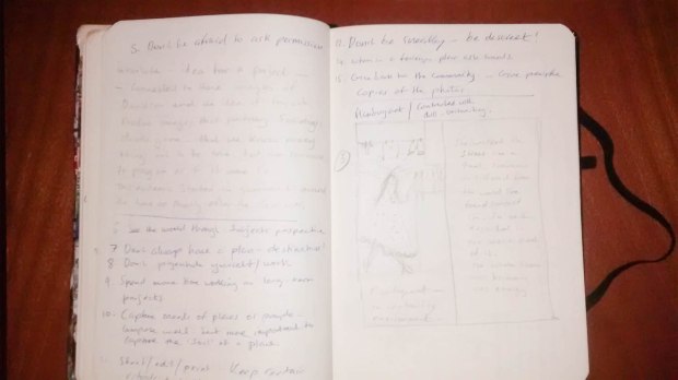
Language of light-part4 learning log notes

*NOTE: The log notes format changes here so that they are clearer to read. I only include some pages that are scanned, mainly diagrams and drawings.

In this set of log notes, I am changing the format of how I present as previously it has been difficult to scan adequately and preserve eligibility of the notes. Instead what I will do is present the notes in a condensed form from my rough log book and only post up images of diagrams and drawing. The style of the notes is therefore a bit more mixed as I often interspersed reflections with quotes or questions and points. Chronologically it follows the actual way I wrote the notes up during part 4.

Exercise 4.1 metering:Experiments done here with light, dark and mid-tones reveal how camera measures and adjust to acquire 18% grey mid tone. Thus showing how there is a need to be creative in response to exposure setting and not always rely on the camera meter to perceive nuance.

Exercise 4.1

assign4-1-of-1-18

assign4-1-of-1-17


Notes/quotes from studying Joel Myerowitz

“You have to trust your instinct because you are your instinct as an artist”

“Many things draw us towards images that are just cliché because they are seductive but have no content”.

“It’s challenging to make a picture in the city-of the space-where things are disconnected but something must hold them together”

“One thing shows you the doorway to the next”


Reflections on Joel’s quotes

Im especially fond of the quote “One thing shows you the doorway to the next” as this reminds me of what happens in the creative process. It can seen as if nothing is moving and then suddenly all our energy gets ‘behind’ an idea or a vision to express something and doors open.

I very much like Joel’s attitude towards photography. Like many photographers of a similar genre and time, there is a philosophical underbelly to the photographers thought process and work. This can often feed into their work and produce fascinating images.


Sally Man’s photos/my reflections

Sally man’s images reveal quite a lot of emotion. Melancholy especially shows up as theme an a sense of passing time, death and the inevitable process of ageing.

She explores these themes well. One of her techniques is to use a non-coated lens of a full format camera. This gives the ghostly, eery and timeless feel to a lot of her images. There is sometimes the use of sepia in her photos too. She used these techniques to highlight something about the place she is in. She often shot her photos with her family in the ‘deep south’. Something here about timelessness or time not moving so quickly, slow-moving processes.


Micheal schmidt.

Schmidt offers ideas in his photos that are neutral and diffused in terms of the light. He claims that this offers the viewer greater objectivity in viewing and leads to an impartial seeing. He also shot in black and white to promote this sense of neutrality which he claimed is desirable for documentary photography. Whilst I see his point, I also think that this is just one point of view and not an absolute statement about documentary photography and the use of light.


My reflections on Schmidt

The camera has many voices and I think that it is almost certain that any photography will have some degree of subjectivity to it-even if it is just the composition and the angle of the camera. I doubt that any photograph taken intentionally by a pro can be purely objective. Most of the time photographers take photos with the conditions of the photo in mind such as light, place, angle of view, composition of content etc. Therefore, the idea of ‘remaining neutral’ I find somewhat questionable.


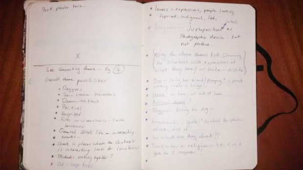
The way in which the exercises helped guide assignment 4

All of the exercises in Part 4 have in some way influenced my final assignment. To start with we looked at exposure in 4.1 This guided me to experiment with exposure and effect. With my assignment I had at first underexposed the images. Although I was aiming for dark tones and a low light set of photos In fact the underexposure did not help with the expression of the theme. So, I needed to learn that dark tone photos and the type of images that I have produced might be a bit different in effect.

In project 2 Sally Mann’s work also inspired to some extent the vision of making the photos that I made. However, later I realised that she was not the best influence for the studio work that I wanted to do. However, her otherworldly use of light greatly inspired me. Her ‘non-coated’ lens look can be reproduced by putting a plastic bag over the lens with a good whole in the centre. Perhaps at a later date I will see if I can emulate her and do some sepia photos in this way.

Exercise 4.2 made me think about hues of light and how daylight can change the appearance of the subject quite forcefully. Each time of day seems to have almost a certain emotional quality that it evokes.

Project 3 Lekic’s photo was major source of reflection and formed in a way the basis for the assignment along with the image Ophelia by Gregory Crewdson. Both Crewdson and Lekic provided a technical basis for developing my own project. In Lekic’s photos it was the focal points of light (windows) in the darkness that made me think of faces in the dark, of people coming out of or going into ‘dark spaces’ and moods. Although my photos have a lot of colour in them and cannot be seen to be wholly nihilistic, still the ambient of dark tones supports the work and the mood.

Exercise 4.3 Ambient light in the street at night taking photos under phosphorus lighting was a good exercise for working to expose at night under artificial light conditions. A light that is so different to daylight.

Exercise 4.4 shooting artificial light is about the time that I decided to do the studio project for the assignment. Partly this sparked my deep urge to learn more about artificial light and how to control and use that to optimum effect. I used a log in a darkened studio to explore mood and it was here that I saw what I wanted to do for the assignment.

So on the whole the exercises provided a clear build up that led into the assignment in this case. I felt I learned a lot about lighting in general whilst going over again some old knowledge and clarifying that.


Exercise 4.2

Diagrams of camera position with some details about the shooting for exercise 4.2

assign4-1-of-1-15

assign4-1-of-1-16


Beginning some research on lighting

Subject lighting

Micheal langford  – basic photography (1997) focal press.

  • 6 features of lighting :
  • Quality
  • direction
  • contrast
  • evenness
  • colour
  • intensity

Quality: concerned with shadow, i.e. hard or soft, clear etc. Types of light also: diffused or hard etc.

Direction: Direction of light effects how we mould the light to the subject. It is also a language in itself in that it changes the emphasis to what you are photographing. See my exercise assign 4 for more on this. 

Contrast: Lighting contrast is the light that hits the illuminated parts and the shadow parts of the object.  Typically sensors of digital cameras cannot gauge very well the distinction as well as we see with our eyes.

Changes in metering are often necessary to accommodate for strong back-lit situations or dark.

Evenness: Depends upon light source and distance ratios. Ratios are this: 1:4 (1mtr) 1:2.3 (2mtrs) 1:1.7 (3mtrs)

Intensity: Intensity is controlled by exposure settings and lighting levels can effect depth of field in the image.


Exercise 4.3

We explore artificial light here. I have taken several sequences of images and for the course submitted some that I did on the street on a village in the south of Spain. Artificial light is in the form of sodium street light can give a cast that is orange and somewhat undesirable. Below are diagrams of exercise 4.4 (studio light with a log).


Exercise 4.4

These are diagrams of the studio set ups I used to do exercise 4.4

5 images shot for the exercise.


 Back to Langford M. Discussing light intensity

In this section Langford discussed the issue of light drop off in relations to distance of subject to lighting distance. This is an interesting and relevant area both for studio and field work in photography.

The diagram shows the distance of lighting to object drop of in ratios.

assign4-1-of-1-11

So we work with light intensity by either changing the distance of the light to the subject or by changing light intensity from within the light source by powering up or down the units that we are using.

Basic formula:

  1. Small light source close – high contrast uneven
  2. small light source further away- less contrast more even
  3. larger light source diffused close in-even soft light
  4. larger light source further away, harder light.

Quotes from Gary Winogrand

“Photography is about transforming the ordinary into something different not making pretty pictures”

“You don’t learn by repeating what you already know”

“Risk failing every time that you make a frame”


Reflections on Winogrand

Winogrand for me is one of the grand masters of street photography. He is a sort of renegade rebel with a camera in his hand out to make photos. one of his famous ideas is that the idea narrative on photos is a complete fallacy. Its impossible to know what is taken place in a photo as you only have a snippet of a frame and its not possible to say quite what is taking place and why. So therefore, no narrative. I’d agree to a  point but I think that there is room for debate there. For example, a series or sequence can be more strongly narrative and therefore portray a story well. I think it depends.

“Photography is about transforming the ordinary into something different not making pretty pictures” Yes I am beginning to see the truth in this. This transformation suggests a certain alchemy with the camera. That actually pretty pictures don’t stick, what sticks is a memorable image that resonates with us. Many of winogrands images do stick with me… and some even seem to begin to transcend the ordinary and become somewhat magical.


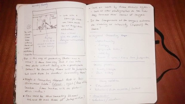
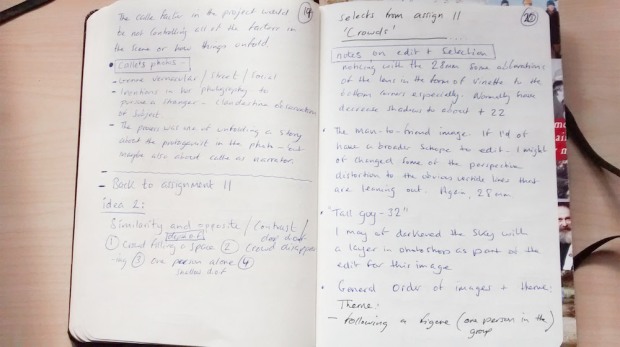
Ideas for exercise 4.5

assign4-1-of-1-12

Here in exercise 4.5 I explore using a map, some ideas for the project.

Development of these ideas: walk around and see how things affect me, contrary to the popular or typical emotional responses or expectations of things or objects. Be alive to how I am influenced by my environment.

Reflections on this exercise. 

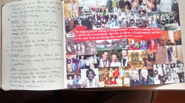
On the whole I have made good use of this exercise to think outside of the box and further afield. To start with it made me think about the proliferation of images in the world and how a great many are simply for the sake of prettiness and without a lot of meaning. This is especially the case with a lot of advertising and such. The idea is to glorify and hype up something so that it appears desirable. To make someone react with a  purchase.

Photos with commercial orientations such as the above mentioned have but one purpose but are almost throwaway, and not made to last. This is a sign of our times. The throw away culture that we live in promotes wastage and superficiality.

So when I went searching the object or situation my mind was looking more to show the other side of the coin in a more realist manner. Hence my photo from the inside out, or a ruin, with the sense of beauty more incidentally placed into the photo but outside through the window.


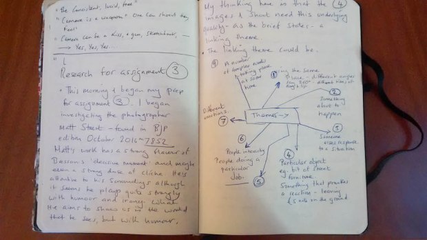
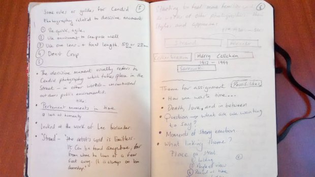
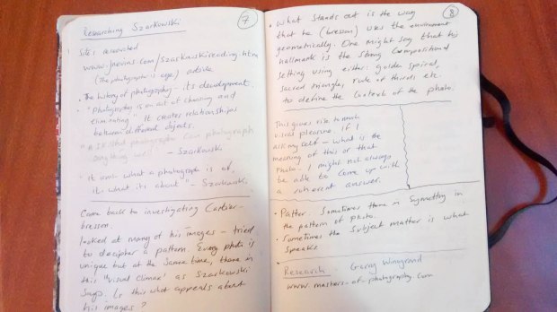
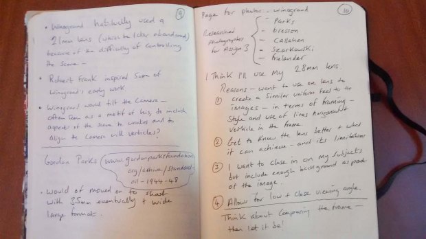
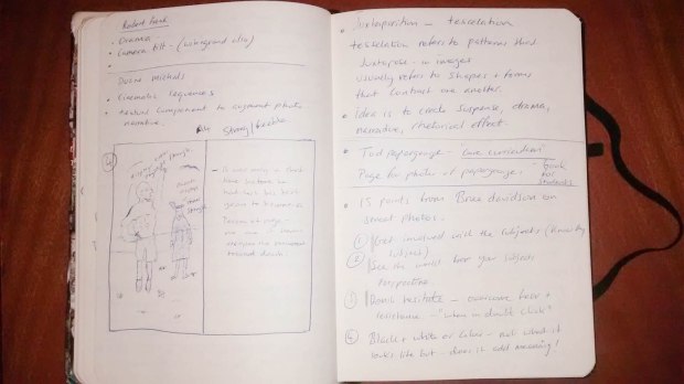
Researching assignment 4 (see assignment 4 research for more)

assign4-1-of-1-9

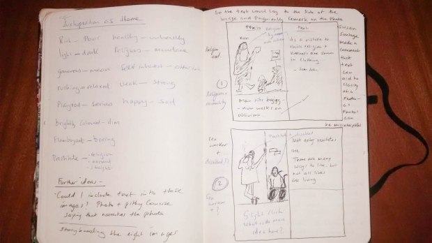
On this page begins my planning for assignment 4 which I had chosen to base on studio lighting. These ideas, as is often the case with my pre-stage thinking, change and things develop.

I have spoken about the route I took and why, in my assignment so I won’t repeat that here. I chose as a theme to create a narrative out of 8 images using studio light to emphasis, drama, emotion and give emphasis to the characters’ emotion.

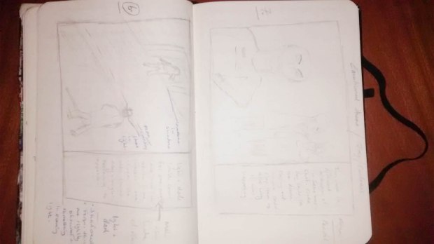
below you’ll see the pre-shoot sketches that I regularly do before taking photos.

These are the sketches (not all) for the scenes that I produced before shooting. They are not all there because some I created on the day of the shoot.  They do not follow any particular order.

You will see that both some of the ideas of the original scenes and the actual shots have changed. But for the this pre-shoot visualising and scribbling have become an indispensable part of my planning for any assignment nowadays. It is a premeditation within which ideas form and then get consolidated so it is rather important.


Interlude for doing some test shots

I want to do some test shots because I feel that I need to see both how I need to measure the light by turning my phone into an incident light meter and because I want to pre-visualise the scenes that I will shoot. I need to see what I am doing before hand. Not only that I feel that I need to get a sense of the camera set up and what shutter speed to use and ISO.

I’ve decided to tie together the photos with a theme that will be a story. I need to make it into a story that tells a relatable and believable picture tale. It will be about love and the end of it. Everyone can related to that!

It would be good to be more nuanced and subtle about it. But I think that with this shoot I’ll be more suggestive and direct as primarily I want to practice lighting. The story telling can come at some other time.

Things to consider for the shoot.

  1. Several LED lights will be needed to multi light the scene
  2. When (if) I use flash I’ll need to make the necessary steps to balance up the white with the different lights (as it happening I did not use flash in the end)
  3. One main lamp and one smaller lamp. The actual lamp in the photos will be ‘self lit’ using the led from my mobile phone. This won’t cast any light into the scene or very little.
  4. Shoot some images with 85mm on my full frame and others with 35mm in the fuji film pro1.
  5. Test shots came up as: auto-white balance, f/2.8 1/15 second (actually 1/20 1/50 were used on the day) and ISO 200-320.Did some activities to practice lighting: Child J. & Galer M. (2008) photographic lighting, focal press.
  6. Key light and fill light considerations.
  7. Considering the issues around working in a low key dark tone environment.

I used two photos by two photographers for my research and my influence for assignment 4. This can these can be found on the assignment 4 page and the assignment 4 research pages. I also did analysis of my own images which one can see on the research page.

During the test shots I also did some activities to practice gauging the light needed for the shoot.

Exercise 1.

  1. Place a light 1mtr from the wall and measure the light with incidental light meter (my mobile app)
  2. Then move the light back 1mtr, re-measure
  3. Move the light back 2mtrs more and re-measure.

Finding were obvious. There is a 4 stop drop off in light intensity from 1-4 mrs. This experiment proves the need to observe adjustments to light when moving objects and light around in a studio as we can quickly alter the intensity of light without being aware.

Exercise 2.

  1.  To look at shadows and diffusion  place a light near to the object with diffusion 1mtr from the light
  2. Place the light further back with diffusion closer to light source
  3. Remove the diffusion and experiment with near and far distance to object to perceive harder shadows

The diffusion acts to throw a softer light thus giving softer shadows onto the object, the no diffused light naturally produced a harder shadow, more intense and delineated.

General notes on dark tones and light tones and metering for them.

The camera’s TTL meter will record dark tones as mid tones, mid tones will be recorded as light tones and light tones overexposed.

If light tones are dominant: Light tones get recorded as mid-tones, mid tones as dark tones and dark tones get underexposed.

This is a useful little formula to bear in mind when one is shooting under any circumstances so that we can adjust the camera’s exposure compensation to achieve better results in the camera. Any lack of lighting into the dark tones cannot be made up post shoot. If the data is not there that’s it. Therefore good to bear in mind.

Problems with shooting in low light conditions are numerous. One issue is that of excessive noise if we use hight ISO. The other is banding, again due to lack of light into dark tone areas of the frame.

So the trick is to do a good exposure in the camera when there are dark tones and in post edit one can reclaim the detail in the dark tones.

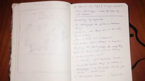
Exploring Crewdson and Lekic’s photos. This I have done in the research section. Assignment 4 research


Why dark tone images appeal to me

Essentially it comes down to mood. I really love the way in which one can see light more clearly enhanced in dark tone or low light photos. My series of images for this assignment are essentially an exploration of the that to quite an extreme in the sense that I wanted very little to be lit, mainly the main subject. The background in some of the images is merely suggested. This was intentional.

On balance I prefer to work with dark tones and shooting in low light. I also like to use the fill flash technique in low light conditions for subjects that can be interestingly brought into relief with the use of a puff of flash light to enhance the scene.

My viewing of photographers such as crewdson, Michals, Lekic and others have inspired that way of looking at light within predominant dark tone atmosphere. Also the work of Philip lorca di Garcia  inspired this vision of dark tones with an illuminated subject in the midst. You can see his ‘heads‘ series for a fuller view of this. I think that dark tone/low light can be highly expressive if used well. It can communicate in a nuanced way much emotion.

David Prakel’s advice on keeping a record and log of studio set ups. He recommends keeping set up notes on the following:

  • Subject
  • background
  • Camera

I would include also in my log a good record of post production work so that this could be saved and used in similar creative situations in the future.


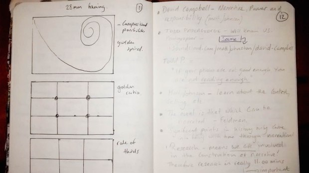
A look at composition..some reflections

compositions is complex because the rules can change and the photo can still work. So why do we have rules of composition? Because we need to train the eye and because we need the discipline of compositions to be able to branch out and explore. However, being slavish to composition isn’t the point. That type of photographer abounds. There is fear of getting it wrong so they play safe by the rules. But this is not creativity as I see it, this is slavish adherence to a rule. However, it would be loose and poor form to ignore composition. I think its like any discipline, one has to learn the work, the masters and then you might be in a position to start to call yourself independent at some point. But we have to ‘cut our teeth’ first.

So, I reviewed composition just to remind myself how to look at an image through the viewfinder. I find its worth coming back to basic at times. It more like a spiral than a circle in that there is retiring but climbing up at the same time, it’s the same old thing as before. Looking more deeply in to the subject you learn new things as there is no finite point. No end goal.

These diagrams are copied from David prakel: Basic composition (2006) AVA publishing


Pre-visualise the scene before shooting/ reflections

Before taking any image learn to pre-visualise it in the mind’s eye perhaps before even looking through the viewfinder. This can help a great deal to enhance the outcome of what we are doing and shooting.

Creative thinking leads to creative work. As I said in assignment 4: “if you can’t visualise it how can you shoot it!” Therefore spending time thinking  about the scenes and the images works. As I have been doing this subconsciously and more consciously with this assignment I think that it has paid off.


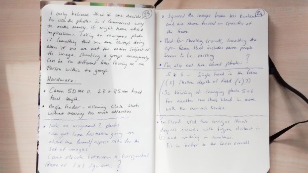
Analysis of images for assignment 4

The images for assignment two consist of a story of sequence narrative (mildly cinematic) that depict the end of a love affair. There are two main protagonists. The photos are done in a dark tone low light setting, within a studio. The use of spot lights have been used to help create emotion and atmosphere. I wanted to push myself here so I created a situation that was a bit of a challenge.

The first image has three main focal points, one plane and a relatively balanced symmetry in terms of the layout of the frame. The lighting is stronger to the face of the character than to the other points within the frame which was intentional. There are mainly vertical lines within the frame or at least implied vertical lines. The angle of camera is to one side and low. The photo was shot with a 35mm fixed lens at full aperture f/1.4
The second image, a man lying in bed, has two focal points and two planes. The background shows a picture frame turned around which suggests a rejection of someone. The man weeps, and the image mainly focuses on this. The failing in this photo might be that the face is too far from the camera. It may have worked to have filled the frame more with the head such as with the face of the female that has a full portrait in the frame. This could have helped consistency for the sequence as I wanted to show both faces within the sequence to highlight their feelings.
The third image shows a man leaving a through a door. The end result of a broken relationship. The light is thrown mainly onto his frontal body leaving the back in darkness. The fault here is that the reflection (fill light) did not reach sufficiently the back of the head thus it is too obscured. The lines are strongly vertical and there are two parts of the picture. The door and the man. Undoubtably this image could have been set up and dramatised in a better way. I went in a sense for a more simplistic image as I was looking to portray the light. The light in this scene in retrospect does not quite work as I might liked it to of done. It gives the impression that he is in the headlights of a car rather than a more softer diffused light to create a solemn mood, which was the aim. To shoot this again I would aim to produce a softer even light on the figure.
(image 4 is image 5 in the sequence) So the next photo is of a woman now finding the letter that the man wrote and having her initial reaction of dismay. This is my favourite image of the whole sequence and the light (although could have been softer by moving the light further away) serves to emphasis her form and beauty. The light is a bit heavy but it fits in with the sequence overall. The draws to the other side of the frame should have been lit more. There was small LED pointing towards them from the side, but it has not given sufficient light. When I explored putting the light in another place it created hot spots in the camera as the direct light was too strong.
Picture five, we see the face of the woman close in. She is shocked or grieving (one of the two!) directing actors is difficult as they don’t always produce quite the subtly emotional states that one might like. The light is gentle and shows mainly her face leaving the hair somewhat in darkness and darker tones. Between her arm and her face there is a narrow implied triangle which makes the picture a little more dynamic. The arm on the head emphasises her grief.
The next two photos (6&7) show scenes or stages of the impact of what has happened i.e postures of grieving. I decided to shroud her mostly in darkness and frame one eye in light and have most of her face in dark shadow. This exaggerates quite a bit the situation. However, it says in the book- Basic composition: “exaggeration is one of photography’s most powerful tools” Prakel D. (2007:100). Picture 6: Main focal point the woman’s half lit face doubled on the chair. background, the lamp which provides a suggested context or place i.e a living place. The light is too strong between light and shadow and it would have been good to of used a fill light (reflector) to distribute some light to the other side of her face and body. The light is a bit too one-sided. As for portraying a mood I think this happens quite well. She is increasingly showing signs of resignation. A sort of falling into herself.
Image 7: here I placed the model in the supine position because it’s seemed like the ultimate posture of resignation. The focal points are her face and principally her hand whereby she has cigarette. The angle of view is low and the frame is mainly filled will her torso and lower body flowing in and moving across the frame. I was aiming here to give a sense of the feminine, curving and gently moving out of the frame. The lines are mainly horizontal although the position of her hand dropping down and he lamp at the back offer some verticality in the picture. The cigarette was aimed to be the main focal point.
Image 8: Resignation turns into rejection as she burns the letter from the ex-lover. Here the lighting and posture changes. There is a more open sense to the photo. For this image I used the light bound off of the ceiling because I wanted to bring more light generally into the scene as if to say things will be alright. However, I am not that happy with the lighting. The effect of the overly lit parts of the frame and dark surrounding don’t quite work as well as I had imagined. On reflection it could have been good here to of bounded flash off of the ceiling as I could have controlled the diffusion more and softened the tones a bit. This is however an idea, one that unfortunately I did not try on the day.

This concludes my log notebook for part 4 of the course.

Log notes-assignment 3

General log notes for assignment 3

Here are my systematic if not some what untidy blog notes that I produce for every assignment. They show the thinking processes and eventual conclusions of each phase of the assignment.

*NOTE: Log note format changes from assignment 4 onwards to make reading easier.

*Analysis of images for assignment 3 and self evaluation here at the end of the log page

 untitled-1-of-1-2 untitled-1-of-1-3 untitled-1-of-1-4 untitled-1-of-1-5

untitled-1-of-1-19

untitled-1-of-1-6 untitled-1-of-1-7 untitled-1-of-1-8 untitled-1-of-1-9 untitled-1-of-1-10 untitled-1-of-1-11 untitled-1-of-1-12 untitled-1-of-1-13 untitled-1-of-1-14 untitled-1-of-1-15 untitled-1-of-1-16 untitled-1-of-1

Evaluation of my work for assignment 3

Generally I think that I have executed this assignment fairly well. I have learned a lot from the research and practicals that I have done.

In terms of the assessment criteria I’ll give a self-analysis here:

Technical and visual skills: I was pleased with the outcome. I think that my visual observational skills are developing well and I am learning to differentiate between what is and what is not relevant to the photo. I have been cultivating the skills of pre-visualising images before taking them. My techniques are fairly developed although I need to work on some areas to do with focusing and depth of field correction. I have at times not focused sufficiently on the subject thus leaving areas of the frame blurred. This has partly been due to the nature of the project in terms of ‘street photography’ and capturing ‘decisive moments’ from the hip, once or twice quite literally.

Quality of outcome: I was pleased with the way that the research helped me to develop my ideas and focus the photography in this project. There is room for improvement for both research and execution of ideas. I planned the project in a practical sense to be coherent, by using similar light conditions and only shooting with a 28mm fixed lens for example. All frames are horizontal and the angle of view and distance from subject has as certain coherence to it. In terms of the ideas I have tried to communicate (Juxtaposition and ambiguity). I would give myself 7 out of 10. Whilst I was constantly alive to the theme as I was shooting it seemed at times difficult to realise what I had pre-visualised. I wanted stronger shots with more punctum!

Demonstration of creativity: Here I think that I did well. I tried to develop a theme creatively without giving into the desire to produce ‘nice pleasing pictures’ which is a tendency for us students in the beginning at least. I took my time to seek out situations and contexts to photograph meaningfully rather than just looking for light conditions that would give a ‘nice’ picture. I let myself explore different subjects. I need to work more on the ‘taking risk’ part of my work as there is sometimes the urge to play it safe.

Context: Here I think that my planning, reflection and critical thinking has been of a reasonably good level. Added and changed April 2017:

I researched a number of key photographers for this assignment. In particular the work of Bruce Davidson and Gary Winogrand stood out for me. I find that street photography is quite a variable discipline that varies greatly from artist to artist. It seems that the rules can change quite dramatically for what makes a good street photo. For me these two stand out as particularly masterful at capturing what street photography can say. What I gained from looking into their work and similar photographers of street photography is the necessity to be alert to the moment and curios of details. Awareness of what is happening seems crucial and the ability to connect what one is seeng with what it might represent on another level seems important. In addition I think that the best street photos are taken in a range of 2-3 meters of the subject so that you feel a sense of being in the scene. I observed that my interest in subject of other photos that are further out are less engaging. The main things that I take from my research and study of street photos are these. That 1) a lot depends on your proximity to the subject 2) good street photos need to that portray something about the human condition that are universal, are more appealing than the sort of photos that aim to entertain.

Analysis of images:

Photo 1: Two buildings of different time periods and man on bike

Foreground, man on bike passing (mid ground) an empty abandoned building. Background, a modern building. Focal points are the buildings and the man on his bike. Colour tones are subdued as the ambient light was flat. I would have liked to of illuminated the scene with artificial lighting (fill flash technique) but it did not seem feasible for such a large-scale photo. Faults of the image. I think that the top of the building and the lower edge of the bicycle wheel should have been kept in the image for completeness and symmetry. There are slight vertical distortions due to the use of a 28mm lens on the buildings. The angle of view was chosen to place the buildings in such as way as that they were facing in opposite directions from the front view. I think that this adds to the dynamism of the image.

Photo 2: Beggar and bike man, with ‘pet chimp’!

A man walking in the street with his bike, another sitting in the street begging. A tension is set in place between the two figures. The mid and back ground show the street, moving back into the image. The depth of field is shallow and this is a great mistake in the image. I shot this with a visual composition not using the view finder. Therefore I made the mistake of not first checking the D.O.F and shutter speed. Learned that lesson painfully! Focal points are the beggar and the man with the bike. The scene portrays Juxtaposition and a feeling of opposites. There is a mild tension between these two slightly surreal characters.

Another fault of the image is that the subjects are too far from the lens. Had I done a more formal composition I would have come in closer to both subjects.

Photo 3: Nun with her back to the camera.

The image portrays as the main focal point, a nun looking away from the camera towards an advert about food, at a bus stop stand. This again aims to produce the feeling of contradiction or juxtaposition. The nun as the main focal point and the advert as the second mid ground focal point are the two main features of the photo. I would say the photo has a moderate impact, not strong. The symmetry of the nun’s stance and the fact that you can see her looking towards the poster set up the sense of someone who is composed internally and not really of the world of adverts, cars and bus stands. Somehow she seemed out-of-place. I learned that working with a 28mm was too great an angle for many of these photos. I would have been better off setting the 35mm standard to these scenes. I found the desire to crop the images several times.

Photo 4: Someone walks down the stairs into a subway, with an umbrella, and someone without.

The central focal pint is the umbrella to one side of the frame and the second focal point the top of the man’s head. The horizontal lines in the frame (stairs) and the Ariel shot make the image stand out. The theme here was more juxtaposition of forms, the textures or the two objects as in the umbrella and the cold grey stone. The ambiguity is not seeing the person. For me the decisive moment arises here in this coming together of conditions. The image, although not a strongly impacting visual experience, does have some visually pleasing aspects to it. The 28mm lens shows its problems in the slight asymmetry to one side of the frame. It might have been more interesting to wait for a more colourful umbrella, something that stood out more obviously.

Photo 5: An arm and hand appear inside of a ‘confession box’.

The image is shot at close quarters again with the 28mm and the main focal point is the action of the fingers pressing into the door frame. Here I draw out ambiguity as it’s not clear why this happening. Faults of the image. There is too much noise in the frame as I used high ISO. Although I think that some noise actually works well with this photo. The ideal composition would have been to frame both parts of the confession box. I wanted to achieve seeing the figure although in silhouette on the other side. The hand lacks sharpness.

Photo 6: A pair of legs in jeans (damp inside) and an older man at his side (legs)

The main focal points are the legs, especially the area inside the legs that appears to be wet. This sets up an ambiguous situation visually as we are not sure what this is. Is it rain? Did he not dry his trousers properly? Something more sinister? We don’t and can’t know. This is the devise of ambiguity which I am learning has a power in photos. The angle of view is low and slightly to the side to give a little visual ‘off-centredness’.

Photo 7: Woman sits at a bar – clock to her side.

In this image the main focal point is the gaze of the woman. The clock serves as part of the composition and the bottles of alcohol as another. The three things go together not as an intentional story, but there is one in there. The woman is framed off to the side and the clock balances the composition. Her head is somewhat framed within the door frame which gives a certain clarity of focus. If it wasn’t for her eye, darkly painted in make-up I doubt the picture would have much visual appeal. It is this eye which gives some insight into the mood. The fault of the picture is the distraction of the lower left corner. These objects do not add anything to the image and are surplus. They were caught in the ‘crossfire’ of taking a clandestine picture. The angle of view is low and I think that the picture would have had more impact at eye level. However, this angle of view does highlight her posture which was one of the striking features of the picture that I had pre-visualised.

Continue reading “Log notes-assignment 3”

The ‘decisive moment’ question…

Where I am at with the ‘decisive moment’ question

In a sense I find myself in two camps over this question. In terms of the aesthetics of the present moment, I think that it is important for an image to have impact and for there also at the same time to be something more mysterious or no too overt and obvious in the photo. Something that leaves the imagination to work a bit and think it through.

Graham’s work for me leaves holes and questions such as, if there is no real decisive point within the frame and we are asked to not expect a focal point or decisive moment, what is the purpose of the photo? Where does it take us or what does it intend to demonstrate? Are his images just vague and confused? Even in the apparently not so decisive moments of Graham’s images from the series ‘The present’ (2009) one still sees an intention, execution and a focus to some extent. The actions on the frame are not so clearly defined as they are with Bresson, but still there is a particular focus and presumable the artist wants to say something using the composition to communicate.

So for me I stand on two sides, taking more of a side with Bresson and the ‘decisive moment’ which perhaps is another way of talking about a peak moment or moment of creative fusion between different events to relate a message or meaning. However I think that the fact is is that other photographers can try to copy Bresson and this can become a cliché that is stylistic. In this case it seems that the photo becomes more about style than image or art.

So I conclude for myself that it is not a black and white affair. I can neither say that every photo needs to be a decisive moment affair of the type of Bresson (otherwise every photo becomes a similar expression even though the objects change) nor can I say that I disagree with Graham totally in his attempts to use any context and any moment to make a point. I suppose it comes down to what the photography is intending to do and the best way to go about communicating that.

Log notes: Cartier-Bresson ‘Just plain love’

Log notes 

Cartier Bresson and ‘Just plain love’

For me Bresson is more than just an artist. He symbolises the sense of what perhaps an artist at his best should emulate. The idea that the artist should be radical or try to identify points of growth for society and demonstrate those through art is one that inspires me.

Bresson speaks mysteriously about his art form and in a way does not talk at all about technique beyond the basic mentioning of the geometry he abides by or ‘sees’ when making his compositions. His main discourse is about the intuitive element within the art form of photography. “You have to be receptive, that is all”  states Bresson. “Just be receptive and it happens…”. This is a beautiful and noble idea, but one I think that many photographers are very far away from. Maybe this is due to lack of any really strong ideals or vision in their photography or poor visual skills.

Bresson clearly had this sensibility developed to a high pitch. Can we learn this sensibility or is it innate? This is one of the questions that comes up for me. In theory one can develop whatever one practices. But at the same time there needs to be some innate sensibility to develop and each has his/her own level of that. I believe that Bresson brings up an interesting point in this film. When he talks about most people not taking the time to look properly he is stating I believe something about our age and time. Whilst Bresson was of a particular age in photography and of a particular genre he speaks I think a universal truth that is timeless. That there is a tendency towards not paying attention to what’s in front of us or failing to look beyond the objects in themselves to see the meaning they portray.

This theme for me is one of the most interesting in photography and related to some extent to the discipline of semiotics and meaning within images.

Later in the film Bresson says “taking photographs demands enormous concentration”. Again this idea relates back to the ability to see. I also think that he is talking about taking a strong interest in what you are photographing. In other words, is Bresson’s statement an indictment to pay attention? I would say so. But perhaps he means not so much the forced concentration of someone trying to thread a needle or cross a bridge that is dangerous, but more a sort of spacious presence or a broad awareness of what is happening around us.

For me it is interesting to see that Bresson was influenced by Buddhist ideas and values. He traveled and spent three years in Asia during which time he would have clearly seen buddhism in different asian cultures. Directly or indirectly Bresson would have assimilated some of the ideas of that tradition of which are profoundly related to the visual arts. In particular the training of paying attention and mindfulness or seeing with clear vision are vital aspects to be developed for any serious photographer.

____________________________________________________________________________________________

Reference:

Source:https://www.youtube.com/playlist?list=PL707C8F898605E0BF [accessed October 2016]

Log notes: Assingment 2 + 2.1-2.7

Assignment log notes and exercises 2.1 – 2.7

*NOTE: The log notes format changes for part 4 and 5 of the course to make for easier reading.

untitled-2
(See figure.1.)
untitled-3
(See figure 2 & 3.)

untitled-4

untitled-5

untitled-6

untitled-7

untitled-8

untitled-9

untitled-10

untitled-12

untitled-13
(See figure.4.)

untitled-14


List of illustrations:

Figure 1. mobile phone (2016) [advertisement] in Triodos news letter, summer 2016 P.5.

Figure 2. Man playing trumpet (2016) central cultural de Valencia [advertisement] in brochure for jazz performances, summer 2016.

Figure 3. Woman in room (May 2016) brochure [advertisement] in La filmoteca cinema brochure summer 2016, P.23.

Figure 4. Groups/crowds (2016) brochure [advertisement] in Padmaloka buddhist retreat brochure 2016.

Log notes: exercise 1.1-1.4

log note

*NOTE: The format of the log notes changes in part 4 of the course for easier reading.

These blog notes cover the period Part 1: 1.1-1.4 including general notes and reflections of the themes.

Page 1
Page 2


untitled-3
page 3

Page 4


untitled-5
Page 5

untitled-6
Page 6
Page 7
Page 8
Page 9

page 10


untitled-11
page 11
Page 12