Exercise 5.1: Camera as ‘measuring’ device

Exercise 5.1: Measuring device

My first thoughts about this exercise were slightly perplexed and uncertain as to precisely what was being asked. However I gave the OCA photography department the benefit of the doubt that they know what they are doing and that the idea is to ‘test’ the student in lateral thinking and being open to seeing something new?

I have approached the exercise from the point of view of what I most felt empathy with when going out for a random exploration of objects to photograph and seeing what called up my empathetic feelings. It doesn’t usually take that long before I see something that resonates with my desire to form an image of it.

If you look over my work of the past two years (OCA foundations photography and EYV) you’ll see that ruins appear an awful lot in my shots and projects. I have an empathy for these beautiful and poignant reminders of impermanence and change. This time and for the exercise I have chosen a ruin albeit a modern ruin.

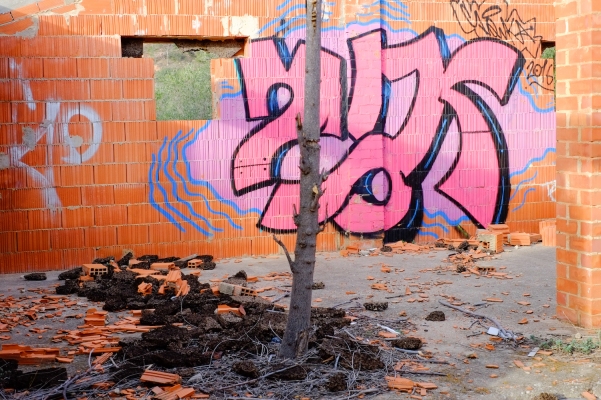
The idea had been to juxtapose the building with the background which is just visible thought the window and shows you the environment outside. Nature contrasted with man made objects. I am attracted to the bizarreness of the image. I think that there is a deeper reason for being attracted to such situations and objects. Whilst the framing of the image was intentional perhaps something more could be said about the content within the frame that was not fully conscious at first.

Reflections

When I framed the image I wanted to bring in various elements such as the graffiti and the window to the outside view of nature and the young tree in the middle of the frame. On the ground as well there is a spree of debris. I shot that frame intentionally and at the time hadn’t thought through all of the implications of doing this. Whilst on the whole there are no ‘mistakes’ in terms of the content of the framing etc. I can see that there is something symbolic in the content if I look closer. Ruins v’s nature, the tree growing into the semi built house and the black insulation on the ground are all clues here. My sense of closeness to the theme is very strong and stems from my childhood when I spent many hours wandering alone through ruins and rubbish dumps and deserted landscapes. The wastelands for me where places of reflection, aloneness and time to be with myself.

There is something poignant in the relationship between the man made structure, unfinished or in ruins and the presence of nature. There is something of a message in this in terms of nature being more powerful and putting things in perspective. The insulation on the ground, although I saw it, at the time didn’t know what it was. It could represent the attempts to insulate ourselves from nature; in this case quite literally by putting a physical layer between ourselves and it. The graffiti is an attempt to embellish something and make it more interesting. Whilst it was in the framing, it also represents the idea of making something more interesting but distracting us from some essential truths. Nature cannot be embellished or made the shape that we want it to be.

Select image
Pre-select images
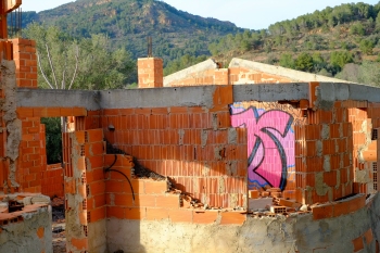
1. pre-select

1.This is one of the pre-select images that I have used for the exercise but later not chosen. The composition show more of the environment where the ruin or house structure are this putting more in context.
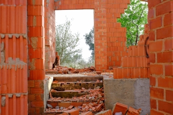
2. Pre-select

2.This image was nearly chosen for the more acute contrast between the sense of nature and the man made environment. However I felt it did not really have enough of the elements in it for the idea that I was working with.

Image taken for exercise 5.1

Exercise 5.2 Homage

5.2 Produce a photo in response to an image that we like.

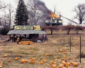
For this exercise I examined a number of photos that I would of wanted to make a ‘homage’ to. I initially thought that I would base the photo on one by Joel Sternfeld-one of my favourite American

Image 1.Joel Sternfeld. McLean, Virginia, December 1978

photographers. He has a sense of poignancy and of the bizarre that other photographers such as Gregory Crewdson also share. The photo is of a fireman on a ladder attacking a fire in the background whilst in the foreground his colleague is buying pumpkins in a store. It is a juxtaposition rite large.

The context for this photo is the 70’s during a downturn in US morale and employment. It is said to represent the way the Americans were turning their backs even as the proverbial house was burning down-a timely metaphor that was well gauged by Sternfeld I thought.

Searching for the image for 5.2

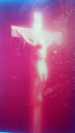
As I rooted through a number of photography books, I came across the image of Andrés Serrano ‘Piss Christ’ (1987). Probably this is one of the most irreverent photos that I have ever seen. The reason that I chose this photo is twofold. First of all I saw it as relevant to our theme of contextualisation. As Juliet Hacking states, if it had not been for the title: ‘Piss Christ‘ it would not of caused such a storm in the public. In other words, in this case it seems that the title created in Barett’s terms the “internal context”. If the photo had been untitled I still believe that its “external context” would of created something of a reaction in the public as it is an image that provokes a ‘double take’ by virtue of the red liquid submerged christ. Not a typical depiction. However, the words had impacted the image as they seem so slanderous. According to Serrano, this was not his intention. This is the second reason for my choosing this photo.

Image 2.Andrés Serrano, Piss Christ (1987)

Intention plays a big part in contextualising the photo. In Serrano’s case maybe the intention was not explicit enough, or maybe his intention was to simply provoke reaction and therefore dialogue. The image was produced as he explained it, as a protest against the cheapening of religious icons and to question the need for faith at a time when HIV and AIDS were at the height. The public read it as a denigration of religion (Christian faith) and reacted accordingly with political and religious leaders alike in outrage.

My homage is therefore to Serranos not so much for the crudeness of the image, although I perceive a certain beauty in it myself, but for the provoking of habitual thought and a questioning of that.

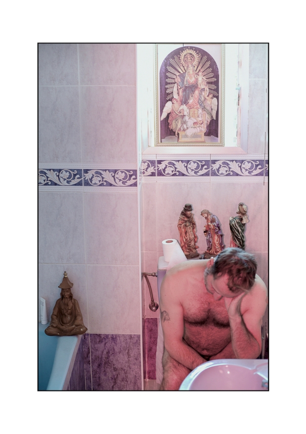
The context of my photo

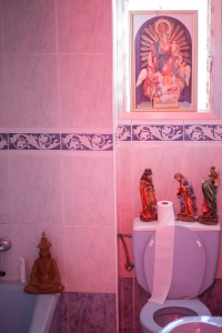
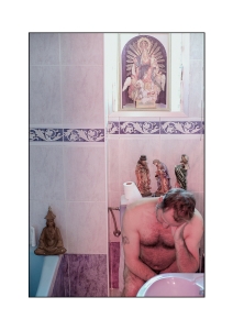
My Image below has elements of the “original context” in that there is comparing and contrasting to original works…in this case the work of Andrés is being compared with the photo that I have made. Comparing and contrasting are elements that fall into the “original context” category. Also the photo offers a theme and a response in some ways to current issues around religion and our views of it. There is an interpretative context going on, based upon the photo of Serrano.

There are also elements of the “internal context” in that one can identify the subject matter, or that which is obvious in the photo and begin to interpret meaning. The objects in this photo represent religiosity although it is not completely certain what is being said. Therefore it is open to interpretation. This is one of the problems often found when looking at photography, it is not always clear what the photographer wants to communicate. The connotations are really the main communicating points of the photo within and I would say is the key “context” for this photo. This point is somewhat subltle and I think it requires further reflection as its not necessarily always obvious. I find the questions below useful for deepening into this three point analysis:

  • What do I see?
  • What does it mean?
  • What is the subject matter?
  • What is the relation amongst the subject matter?
  • What is the form?
  • What is the medium?
  • What is the style?
  • What is the difference between one photos and others?
  • Who made this photo?
  • Why he/she made this photo?
  • Who influenced the photographer?
  • How do you know?

[3](Questions from: Conference paper, Iwan Zahar (2010)

What am I responding to in Serrano’s photo?

I am responding specifically to the idea. The idea that being religious means paying homage to articles and objects of religiosity. I feel that this is what I am trying to say in this photo. That actually wherever you are is the place to practice your religion, including in the toilet! So, in a way the use of imagery that is not just christian (see the meditating figure) responds in a similar way to Serrano. The imagery is different but the message is a response to how he perceived superficial spiritual ideas. That people talk a lot but do not walk the talk. I respond to the photo using my own style and composition but the message intention is the same. When I see Serrano’s image and understand what he says it is very clear to me, why he made the picture this way. My response is one of kind.

Final note*

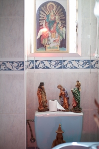
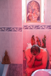
The picture has a red hue to it which I left intentionally as a ‘homage’ to the colour and richness of Serrano’s image. See original images that I took. I decided later to reduce heavily the red (having shot with a  speed light using red gel)  because the use of that kind of light seemed too strong and overpowering. Red however connotes friendship, passion and life.


  1. Image 1. Sternfeld J. Mclean, Virginia (1978), http://erickimphotography.com/blog/2014/02/14/6-lessons-joel-sternfeld-has-taught-me-about-street-photography/ [accessed March 2017]
  2. Image 2. Serrano A. Piss Christ (1987) From: Juliet Hacking, The whole story (2014:438) Thames & Hudson.
  3. Questions from conference paper: Iwan Zahar (2010)https://www.researchgate.net/publication/294089006 [accessed March 2017]

Exercise 5.3 Gare Saint-lazare

Exercise 5.3 Project 2

Look again at Bresson’s image ‘Gare Saint-Lazare’ to see if there is a single element that the eye returns to again and again.

what can I say about the information contained within this pivotal point in the frame?

Image 1. Henri Cartier-Bresson, Gare Saint lazare  (1932).

This picture by Bresson ( a chance photo as he says himself) holds a certain fascination for photographers. Is it simply because it is a photo by Bresson or does it hold the viewer because of its composition. Sometimes I have to forget the name of the photographer to try to appreciate the image without that influence. For me the returning eye moves to the foot and the inverted and normal triangle between the legs. The foot landing but in space about to touch down, a millisecond from being a different shot, is what captures most, my attention. What information is in this?

The information in the image is dynamic, moving and sometimes mysterious as we don’t see the face. In fact we only have a silhouette of the ‘runner’ which always leaves a question. Who is he and why is he running?

The image for me is tied up with the photographer and what I know of him. If it was not an image by Cartier Bresson and I had not internalized an idea of who he was and the kind of photography he produced it might strike me differently. However, I am struck at how the “Internal and external contexts” from Barret’s ideas are beginning to make more sense in these contexts. That there is a natural comparison and evaluation working on me when I look at any photo. The photo contains a certain beauty and dynamism which I can appreciate.


  1. Image 1. Bresson C. (1932) Gare Saint-lazare, found at: http://www.arte.it/calendario-arte/milano/mostra-henri-cartier-bresson-fotografo-31689 [accessed March 2017]

Exercise 4.5: Google screen grab

Exercise 4.5

Make a screen grab of a theme or object commonly photographed and note down how the pictures are similar. Then make a photo of the same theme or object, paying attention to the creativity criteria.

Screen shot of Spanish villages

screen-shot_spanishvillage

Here we have an image of photos of village Spain. What we see are the typical everyday scenes of a country that many of us know, or think we know. I visit Spain very regularly as part of my work and I know the country very well.

The similarities in the photos are first and foremost that the photographer wants to impress, are the exoticism and promise of a good time. The images depict: sun, nature, alluding to good food,  fun and pleasure. In general the photos show us a glorified side of a country that is for most of us exotic and only occasionally attainable. The usual depictions of Spain are that it appeals to the senses and therefore pleasure is promised. The most common factors in the images of Spain are: food, landscapes (breath taking of course) and white washed walls and the stock blue sky.

My images and the exercise

What I have aimed for depicting in my images is in a sense the juxtaposition and contrast of the typical one sided scene that we are presented with in commercial photos. The juxtaposition attempts to show the pleasant appealing side as present but not dominant in the photo. I chose as my select photo the image of an abandoned house with the view moving from inside to outside. The inner scene of the photo depicts quite a different facet to Spain and Spanish villages (which exists in equal measure) to the one we are accustomed to seeing.

I’ve neither attempted to glorify a Spanish village nor hide the more unsightly from the viewer. This is different from the usual type of image in terms of emphasis. We are conditioned to see the pleasant and pretty. Whilst this photo is not outright ugly and I hope that I have achieved an element of aesthetic pleasure in the picture, it does not as such try to seduce.

Preparatory photos taken with the same theme


 Pre-select photo (almost chosen)

This is the image that almost came up as the key select but then I realised that it did not offer a strong enough element of juxtaposition. It could be anywhere! So, I found myself reveling more in this image for the light and implied triangles than for the theme of the exercise.

4-5-1-of-1-5

Key select image for 4.5

Why this image? I felt that it was a creative response to the theme and the question. I have placed the viewer inside not outside and not looking at the entirety of the village scene, but rather a selection. The view from the window suggests that there is formal beauty with the whitewashed walls and hills and exotic plants. The inside scene is not one that is typically depicted with a photo of Spanish villages.

I gave the photo the provisional caption of ‘Spain is beautiful’

exercise-4-5_select_edit2
Spain is beautiful

For looking at what I learned during this exercise it shall be included in the log notes section. In general, this exercise has challenged me to think as it were outside the box. It has caused me to think about our expectations of the visual and how quickly we become habituated to seeing things in a particular way and then made to believe that this is the only or most desirable way to see.

Exercise 4.4: Studio light

Exercise 4.4  

In this scenario we are asked to produce a studio set up and create lighting that is appropriate to the object, with a  backing that also serves to bring out the features and form of that object. In may case I photograph here with a  log.

First an experiment

exericise-4-31-of-1
Experiment with an L.E.D light through a diffuser. I later did not use this for the main photos.
exericise-4-3-1-of-1-2
No2. with L.E.D light and diffuser

Main photos

Each image here has a different light quality and some have different colour. The direction of light is also different. I used a black backing as I felt this was the most appropriate for the type of image I wanted to produce with this object.

exercise4-4_moreyellowlight-1-of-1
Photo 1 light from window on one side controlled by a blind. No other ambient lighting but a diffuser used over the window.

exercise4-4_yellowbackgroundmorelight-1-of-1
Photo 2: Full light that is even from two reflectors and bounced flash from the ceiling using a grid on the flash to prevent light spillage.


Harder clearer light and backing changed as well as a closer angle of view from above and in.


exercise4-4-softlight_aboveflahsgrid
Photo 3: Flash bounced from the ceiling with a grid at -3 ETTL. No ambient light. The colour cast is due to a gold reflector at one side.


Softer light less shadow


exercise4-4chnage_angleview-1-of-1
Photo 4: Light from speed light again using the grid. This time a little daylight from the window and the flash at -3 ETTL. no reflector.


Soft light less shadow


exericse-4-4_windowlightnoreflector-1-of-1
final photo 5: This image taken with stronger ambient light from window with no reflector on opposite side to create a ‘Rembrant’ effect. Clear hard light showing shadow and grain of wood.


Notes and diagrams for studio set up that day

4-4-notes-1-of-1
My studio set up that day

4-4-notes-1-of-1-2 4-4-notes-1-of-1-3 4-4-notes-1-of-1-4

Exercise 4.3

Exercise 4.3 Artificial light

Exercise 4.3 asks us to produce a set of images based on artificial ambient light. I was always confused by the term ‘ambient light’ and so I researched it. Curiously it can relate to artificial light or natural daylight. The emphasis is on not producing extra lighting as in staged photos for example or flash light which is ultimately a staged or produced light for effect.

For me beauty can be produced by artificial or ambient light. It is not easy to manipulate natural daylight although with some skill and a reflector or two plus the time of day, it can be done. With artificial light that is not staged (studio lighting) there is yet more of a challenge. Here I have produced a number of images, that are mostly ambient artificial light but with some staged images that are very basically lit.

Artificial ambient light images:

Images taken outside at night under artificial street light. There were two different ‘temperatures’ lighting here.

What I have learned here is that lighting is incredibly variable depending on many factors. The main factors as explained in the research section are to do with: directionality, intensity, source etc. I explore this more in the research section.

The difference between artificial light and daylight as I see it are as follows:

  1. Daylight is diffuse, more even as it lands on subjects with a variable colour temperature according to time of day.
  2. Daylight is less controllable with photography than artificial light
  3. Artificial light can be manipulated to be warm or colder in temperature.
  4. Artificial light has a more ‘chemical’ feel to it, and it produces different tones and reflections when it is reflected.

Exercise 4.2

Exercise 4.2

Exposing a scene at different times of the day

I took these images from in the village where I stay some of the time during the year. They were shot between 8.00am and 5.00pm.

The first image at 8.00am is quiet, subdued and lacking contrast. It has a soft evenness to it. There is more red/orange in the light.

The second image taken at 10.00am has a more glaring quality, produces more contrast and is more direct as the sun was higher. The highlights are stronger in the scene as it is more diffracted.

The third image is more intense as the sun is higher still. There is little shadow, the light is strong and direct and burns out contrast and colours.

The fourth image at 3.00 pmish is more mellow and quieter. It has more shadow cast, but still has a certain glaring quality to it.

The last image at 5.00 pm is quieter and more subdued again. The feeling is smooth and settled rather than buzzing and intense. There is some cast of orange/red but not as strong as sunrise.

Project 1 Exposure: Exercise 4.1

Exposure: 4.1

Using the auto and later manual modes in this exercise we explore the way in which the camera measures light to establish mid-tone exposure.

Metering mode: Average

Auto mode:

Manual mode:

Findings:

With both auto and manual modes there is more histogram activity in the dark tones section. The pixels begin to push into the dark tone section of the histogram noticeably, but more so in the auto mode. I shot a completely black object at close range in order to try and catch incidental light rather than reflected light.

The light tone images display more grey in the tonal range than do the other two (mid and dark tones). The camera seems to put more light into the dark tones in general.

3.3 Time frame and view point

Exercise 3.3 Time frame and view point

1.Time frame

Viewing through one of my analogue cameras with a shutter release of 1 second this is just about enough time to distinguish the basic form of an object. It is not enough time to deal with complexities of an image in terms of tonal differences or form and shape in detail. Its enough for perception to work at a basic level in terms of distinguishing a tree from a  bed or a rock from a  car. A similar result can be achieved by opening and shutting rapidly the eyes and estimating a time like that of the shutter. 2-3 seconds is more of a normal exposure time for distinguishing forms in greater detail.

2. View point

First of all I spent a good time just looking. I noticed and resisted the urge to just take the shot, as I felt that I was happy with the scene when I first saw it. I spent some time just going over the proportions and angles of the buildings and seeing if my eye picked out any particular points within the frame. I tried to visualise a balanced picture which had all the elements of the foreground, mid and background and the sky.

I then at some point raised the camera and spent a time looking at the view through one eye and the view finder with the other to see if there was a marked difference. There almost always is. When one sees a scene, especially land scape, it can be quite disconcerting once you raise the camera to realise that the framing has nothing to do with what you are seeing with your unframed eye! I realised that this in itself was a useful thing to do. A sort of double check to see if the composition was going to work. Because it was a high view point and I was shooting a broad open area I could afford to compose the foreground so that it played a good part in the picture.

untitled
ISO 100    28mm    F/16     1/40 sec    without tripod

I photographed a horizontal frame as the scene felt broad enough to include interesting detail and because I wanted emphasis the streets and I wanted to exclude detail to the right and left of what I was seeing.

In terms of the process I found that it was interesting to take in such a broad scene all at the same time. The eye cannot focus exclusively on one point and needs to function more in panoramic mode.

Trying not to rush the process I just took my time to sort of absorb myself into the view. The approach almost become meditative.

Slow shutter: 3.2

Part three: Traces of time

Exercise 3.2

I took delight in this section of the course at the instructional words: ‘experiment as much as you like’…this for me is when in a sense I start to find more of the creative energy arising.

So in this section I tried to explore the theme of slow shutter speed from various angles. Experiment is what I did, both working to create some sequences and series. In the log notes and research you’ll see more of the background work leading to this exercise.

Images placed here in the order that I made them in the exercise.

Series 1: Street move

This first set were produced by exposing on ‘bulb’ after waiting several seconds moving the camera on a tripod swiveled 180 degrees. In some cases there and back. Thus the exposure captures a sort of layer effect or even a multiple exposure effect. This was purely experimental on my part.

streeet_move2jpg

These two photos were shot as a pair.

street_move1

With this final image I waited for more darkness and rather than a 180 degree move I simply moved the camera back and forth a little so as not to over distort the composition. The aim of the three images has been to explore a somewhat surreal effect within the photo.

street_move3

A horizontal frame shot as a standard camera movement photo. This induces a sense of dynamism and moment into the picture. In a sense it exaggerates what is actually going on. I like the effect of a simple camera moving action on an otherwise banal image such as this. The leading line structure of the street aid the photo and keeps some discipline in the direction of the eye towards the walking figure.

untitled-2

Series 2: ‘I am that’

After looking at the work of Francesca Woodman I felt deeply moved and inspired to shoot something a bit more existential. I found the skeleton (I teach anatomy to yoga students) and used it as a prop to try to give expression to movement through slow shutter speed. I think that it is a strongly expressive set, combined with the series below ‘My struggle with death’ which used the same prop and a staged image, but with a different idea, that of an inner conflict with death (the idea of).

i_am_that_series_3jpg

I decided to play with the image by way of mixing myself with the skeleton to produce a somewhat ambiguous visual image whereby it is not entirely clear what is happening. In each of these images, if you look you’ll see that the front of the skeleton faces the front of the body. I was trying to play with the visual effect of it being the wrong way around. The skeleton looking into its own body if you like. The idea of the title ‘I am that’ came from a book on hinduism popular in the 70’s. A questionable title with no specific or rather a shrouded meaning that needs to be investigated by reflection and contemplation.

i_am_that_series_jpg

Each image in the series has a different feel. Mainly what I was trying to do here is show a sense of movement but with uncertain reason.

i_am_that_series4_jpg

The image below has a strong adjustment of clarity to (something like -30) in order to blur further the behind and in front aspects of the photo to blend the two.

i-am-that_fb

Series 3: My struggle with death

This is a sequence of four images that I tried to explore dramatic scene taking place as depiction of the inner struggle with the idea of death. The final decider on all matters! I used a range of techniques, including a speed light gelled red. The red ( wanted to add intensity to the scene) seemed appropriate to the struggle taking place. In terms of composition the image works to draw the viewer in on the basis that it has surreal qualities to it.

fight_with_death_series4 fighting_with_death_series1jpg fighting_with_death_series2jpg fighting_with_death_series3

Series 4: Ghost

I used this scene at night to mount an image based on illusion, using a slow shutter speed of 30 secs.

The overall effect was quite pleasing. I also incorporated the use of the light from my mobile phone shone into my face, whilst I moved back from the camera to create an impression of movement.

ghost_1 ghost2

Final sequence

This is a sequence that I did to create a sense of a happening, a story or an event about to take place. Its is staged of course. I think that it could have been improved by using even more blur and less definition in the protagonist. This may have helped to leave some question marks as to what was/or is going on.

exerc3-2_experiments-with-shutter_jpeg